
This project has progressed immensely over the last few weeks. I have spent a lot of time evolving the design style and producing a huge body of work to propel exploration. To manage my work, I divided the project into three design challenges: cover, map and page design. I’ve been bouncing between these, referencing my planning, colour pallets and visual boards.
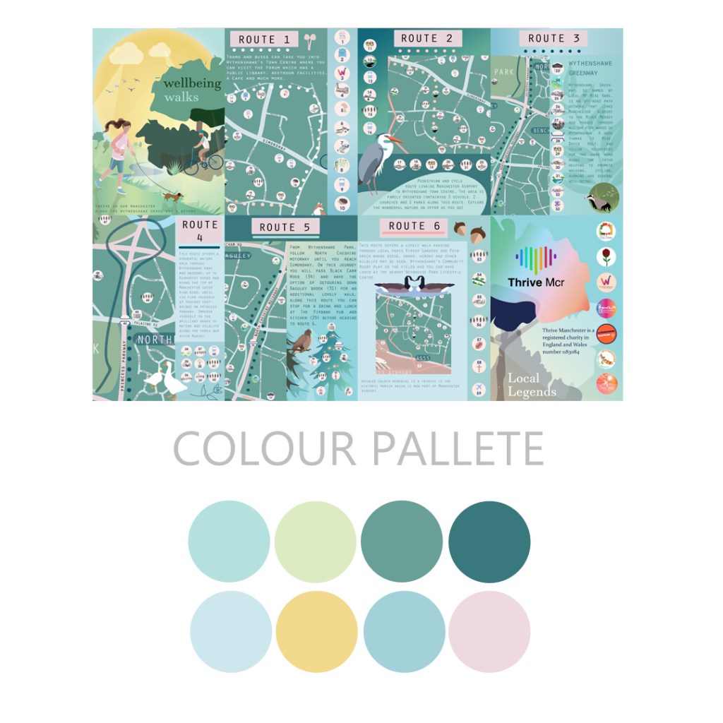

I discussed in-depth details with the Thrive Manchester program directors in advance; noted points on how the booklet would fold and read e.g., landmark symbols, legend, route colours, etc. The design side has been freeing, generating my inspired visions while implementing suggestions and preferences from directors, it has been a very smooth collaboration.
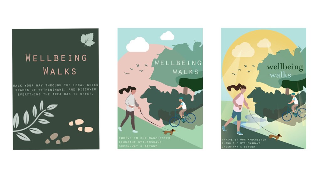
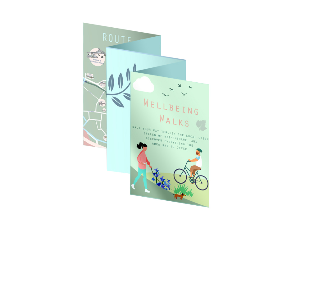
FINALISING THE WINNING DESIGN
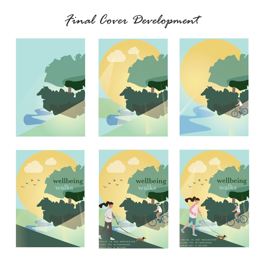
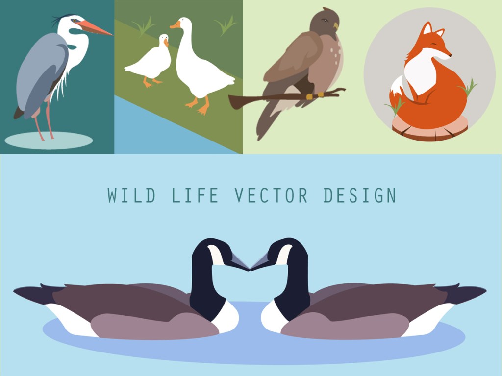
I have updated project managers/partners during design development. Once we were happy with a cover, I played with design potential by introducing alternative colours, clothing and fonts. I then moved onto furthering depth and detail, adding sun beams, rivers, drawing on outdoors, nature and wellbeing. I wanted the visuals and colours for the map and pages to extend through each aspect of the booklet; the fun challenge was finding the best balance of colours and composition. Producing this project using Adobe Illustrator provided many solutions and eased development exploration e.g., ability to freehand vector visuals directly onto art boards, easily alter pantones/pallets, introduce temporary artboards for comparrision. This in hand with Adobe Photoshop has made my design approach much more professional and stress free.
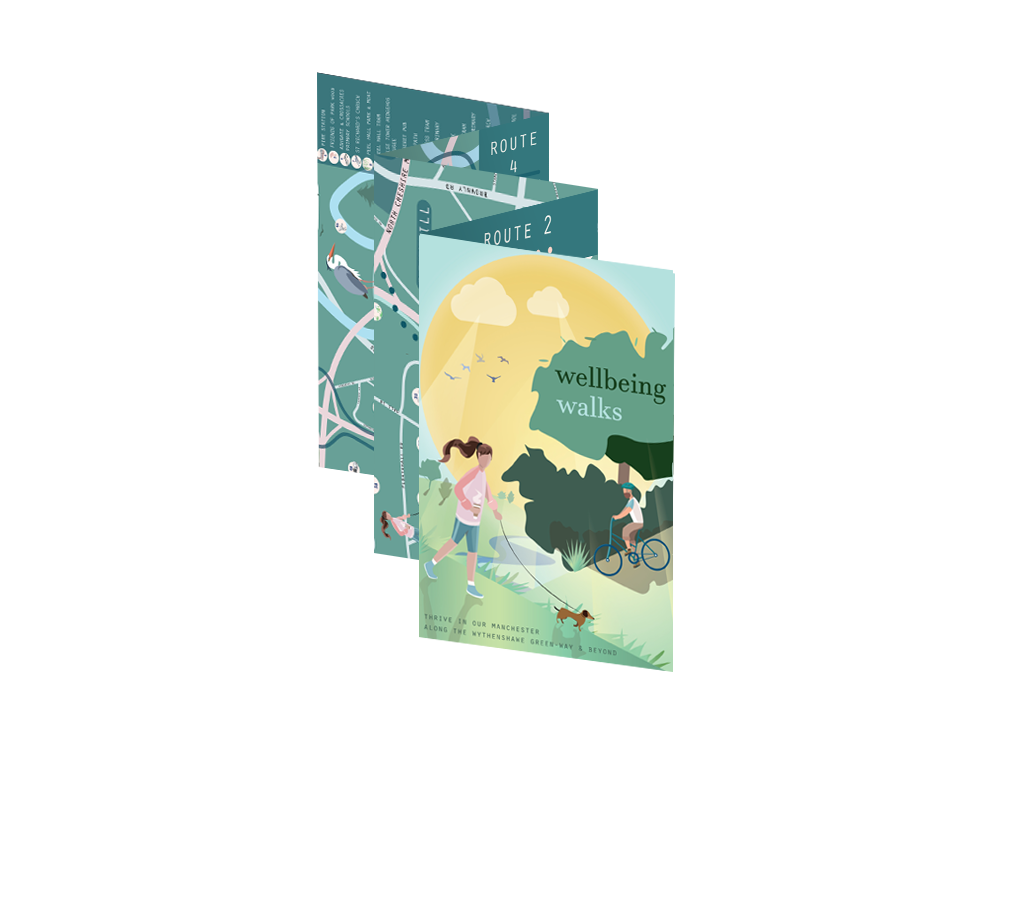
PROTOTYPE PREVIEW
Stay tuned for updates on map and page development!
