Editing Illustrations

After producing a range of illustrations for theme, I wanted to keep experimenting with style and aesthetic, therefore I expanded on a few in photoshop. As I am new to the software I have been exploring the effects and created a variety of samples which can be used in my market research.


Ispired by I P LOBATO


This theme worked of the idea of a surrealist appocolypse respondinig to my artist research and adding alternative design direction for market research. I have been using different filters and options in photoshop to expand on potential.


Influenced by Takashi Murakami

Using my scanned in illustrations I was able to alter the hue’s of the image, enabling a range of quirky colourful results which helped further a pop art quality.

I have been creating colourful works of traditional japanese culture bringing a feel of humour and positivity through the nature of pop culture inspired by Japans Andy warhol, Takashi Murakami.

.

pop art

After producing the image in different colours, I was able to create a pattern using a tile option, I’m pleased with the progress I have made and the amount of options I have uncovered, I was able to play around with layers, effects and transparency, enabling some quirky styles. I feel this will be very beneficial when developing the final theme.


 

pallet knife


Visual Development

Inspiration

After creating a board on pintrest, I was able to gather a range of different yet similar themes for my visual inspiration and aesthetic. I wasn’t able to find artists this way as most of the sites lead to shopping links however I found artists like I P LOBATO, who explore appocolyptic themes which I thought was an interesting approach. From this I was able to identify what feel I want to produce and how I can market this to my audience.

I have also been looking back over my existing material of magazines and have realised I want to create something different, the content of the magazine will include a variety of mindful fun activities, events/opportunity pages and light reading. However, I want the pages to be full of visuals, doing this research is helping me narrow down a general aesthetic that can empathise with each of the pages and cover.

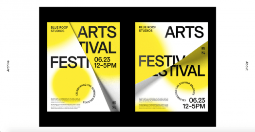
I have found that certain shapes and colours are prefered such as reds, blues, green, white, orange and black, I feel these colours hold vibrant yet down to earth sense. I have picked up on shapes like cirlces and steps which I had involved in my digital design work, I feel compelled to use these shapes as they are so connected to kaizen and the idea of continuous step by step improvement. After experimenting with cover design work, I feel inspired to begin experimenting with the visuals for the contents of the magazine. After reviewing my pinterest board again I feel drawn to a theme of surrealism, using animals, nature, peace and battle to conclude overall subject inspiration through Japanese influence.

happinata-koju-on-a-rearing-horsesamurai-hero-utagawa-kuniyoshi

Artists:

  • I P Lobato
  • Shohei Otomo
  • Ayako Ishiguro
  • Utamaro
  • Katsushika Hokusai
  • Utagawa Kuniyoshi


W6sS2oeef6ohtqxBDiUGMA-650-80.png

Graphic Designers:

  • Nicolas Paries
  • Jennifer Heintz
  • Peter Komierowski
  • Alex Coven
  • Rafael Kfouri
  • Heather Shaw
  • Alessandro Scarpellini

  • Sefanie Buckler

Mental Health

Research of proffessional clinical exercises

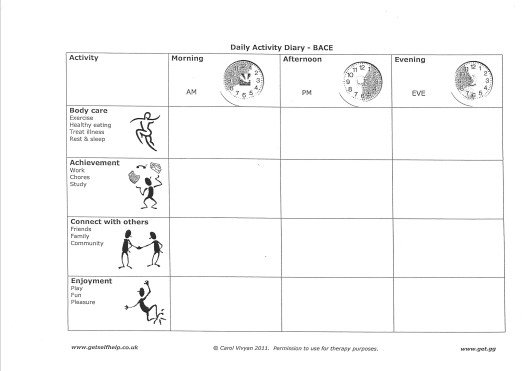
These documents were supplied to a family member of mine by Trafford’s mental health team, we were given a range of carers file and the patient file – I am using the patient file to demonstrate effective work-sheets and advice, an example of what is proffessionally approved and effective.

There were some documents on mindfulness, breathing and meditation, the first recommended step to containing emotions and break downs. I can begin to develop these steps of recovery into the stages of light work (morita therapy), removing a sense of clinical intensity and providing encouragement through supportive, relaxed approach and aesthetic.

scan0132-e1553349953111.jpg

I feel by involving tasks like these, the individual is able to confront themselves, exercise kaizen and activate morita’s principles through non-medical, non-proffessional, response activity, encouraging all individuals the opportunity to continue improving themselves without a therpist, doctor, life coach or medication.SCAN0135

I will use the basic foundation of these activities through a conctemporary and modern aesthetic in order to create fun reflective activities for all people who wants to harness the best version of themselves.

SCAN0137


Interview with Dr Alborz

During my previous project, I met with Alison Alborz a psychologyst and researcher for the Manchester University. I felt it would be helpful to have another chat with her about my current ideas regarding the art therapy book. We were able to converse about the purpose, effectivity, theme and process of the book, leading important ideas into development.

We spoke about the different approaches and purposes of the book such as its use for the art therapist as research and perhaps the idea of individual production, producing them individually for the partiular patient. By exploring the importance of audience which in my case is: soldiers and refugees it became apparent that each of these individuals would need personal themes as they could also pose as triggers.

We spoke about potential ideas for the book, perhaps a book each solider would carry embodying the identity of home such as key-rings, flowers, blankets to the idea of creating a post war rememberance book of their military family.

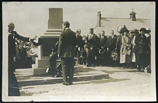
War memorial, Northenden, 1921 unvieling ceremony

This meeting has made me think mostly about my audience, I have realised I must focus either on soliders, or refugees not both. This is because they are very different audiences and cannot provide effective treatment for both as they are suffering from different stresses of war. By producing something for both, I felt it is unempathetic and unethical therefore I feel it is important to rethink the importance of my audience and in that I can begin the development of my practical themes.


Modern Art and War

Throughout my research on art and war, I couldn’t help but pay attention to the role of modern art during ww2, particularly surrounding optical illusion and camouflage.  Painter Norman Wilkinson contributed an early example of this in World War 1 demonstrated through the development of dazzle ships, cubist artists such as Pablo Picasso have claimed the technique was originally created for this purpose. Later during World War 2 in the 1940’s, concepts in theme with surrealism and cubism had been applied to the practicality of war along with the help of artists.

The importance of camouflage and illusion held great significance as technology developed throughout the 1930’s, the visibility of planes from above and figures below had improved through methods of infrared vision and developing technology therefore, visual manipulation was more popular than ever.

Image result for dazzle ship
A “dazzle” ship in 1918.

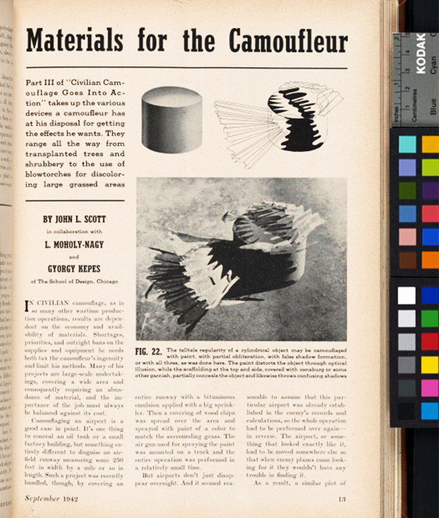
Artists such as László Moholy-Nagy, manipulated vision through kinetic patterns, and shadows in his paintings and sculptures, as a teacher at Chicago’s school of Design, he had the authority to organize students in applying the ideals of camo design after the breakout of war. The contributions of this artist and teacher varied from clever application of pain for disguise, manipulation of distance to concealing a cylindrical target such as a propane tank. The importance of Moholy-Nagy’s achievements earned him a place in the mayor’s personal staff in 1941, given the role of helping conceal Chicago in an attack.


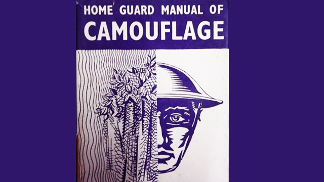
British, surrealist painter, Roland Penrose pursued the establishment of an English standard for concealment during world war two. His important book, ‘the home guard manual of camouflage’ was a diverse guide on well-known painting methods, covering styles such as pointillism and cubism in practical application to warfare. After the publication of his book he went onto found London’s institute of contemporary arts, strengthen the ties between contemporary, modern art and its unexpected aid in war; I feel this research furthers arts role of support in war.


I feel particularly inspired by the connections of mental illness of the concept of camouflage, I feel the exploration of modern art in relation to war and design could provide an interesting contextual starting point for the accumulation of response work. I will begin by producing a range of portraiture illustration work of different in theme styles.