Page Design Development

Developing page visuals
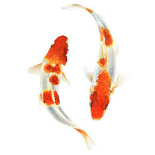
Fish

built layers of coloured pencil, watercolour and fine liner


I began this experimentation with coloured pencil as I felt I could control the colours well, as I went through this process I would scan the drawing into photoshop to see how it looked in different styles, this way I could see what I wanted to change and achieve that.


Above are the results from the coloured pencil illustration, I felt they were cool but lacked a polished air and needed a softer style so I attempted the same design in water colour. After scanning it into Photoshop, I found it lacked outline and form so I added a thin outline with fine liner. I found this held a much neater, brighter visual than my previous designs, especially when edited – I found they looked softer and more professional. Now I had my final design I was ready to experiment with colours, tools and styles, these can be seen in the slide show.


This slideshow requires JavaScript.


Wave

Watercolour, coloured pencil and finer liner


After producing my first activity illustration, I had in mind what style and process I should maintain, I fist created my waves in watercolour, building layers of tone with coloured pencils. After scanning it in, I found it lacked definition so I added the fine liner. I found this instantly improved the illustration and matched the fish well, I then began to experiment with colours, tools and styles in photoshop which can be seen in the slide show below. I found it difficult to identify which style I preffered so this helped me visualise my options and note which tool and style was used to achieve it for final development.


This slideshow requires JavaScript.

I tried out a variety of styles, filters and tools, exploring colour range to bring in a feel of pop to support my chosen theme. I liked the body of visuals from this though I felt these looked more so like childrens activity page, targeting a younger audience than desired.

magic-wand-and-gradient-map-pastle-copy.jpg

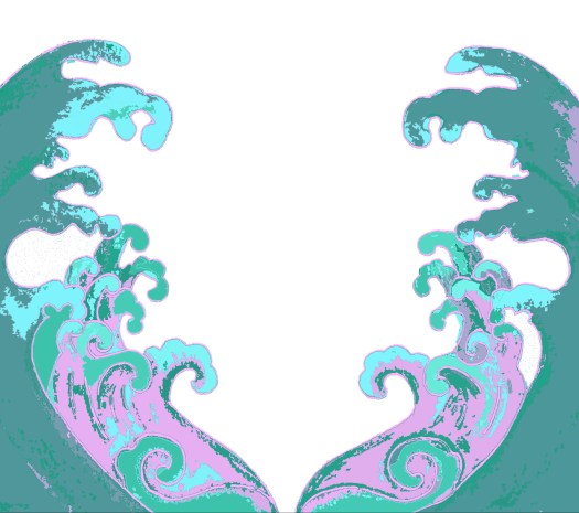
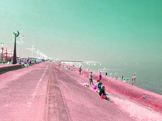
I found that the style “cut out” works best for the illustrative and photographic work, I have been experimenting with it for cover design and feel it pushes the graphic style of the outcome, I like how it breaks the image into colours and shape making it look like a digital painting – This has been a very beneficial journey as this step will be part of the final process for content ilustration and cover design.


Landscape

After developing my steps, I thought about adding to the framing and display of the page, adding detail to the steps by editing the outline and positioning lines. I feel this looks much better than just a box. I then thought about how empty and colourless the page and how I could complete the page and visuals.

SCAN0087

I thought about the visuals and felt it would be nice to involve more imagery as the steps will be black and white. To do this I felt using examples of what could be done with the result would be beneficial so I did them in a variety of mediums:

– sharpie, watercolour, fine liner, pencil and colours pencil.

Examples for the pageSCAN0089
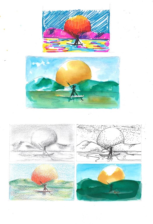
I feel these will help add to the page and work well for inspiration though I do feel a little unsure on how I will compose the image in a minimalist and creative manor, I may need to illiminate certain images or rethink the design.


Page Design and Visual Development

Stage one – Developing potential visuals

Using my content specification document I have been able to narrow down what subject should go with which activity. (Read the image captions to learn more)

Activity 1 – Learning a Language

I decided to chose a koi subject for my learning a language activity as it holds strong ties to Japan and works with the idea of being a fish out of water like being somewhere without knowing the spoken language. I also chose this specifically as it represents determination, ambition and independence as the Koi is known for travelling against the current and swimming upstream, therefore I feel it is an in context subject.


Activity – Mindful Colour

I started this using ideas of bamboo, koi, clouds and waves; I felt the waves worked best as they hold expression in themselves and represent flow and continuous change. By parting the waves as a frame for the creative drawing or expression, I felt I could indiciate a time for yourself,  almost as though we are parting the chaos for a minute of peace.


Activity – Drawing  a Landscape

I focused on drawing simple natural Japanese landscapes for this activity, working well with my minimalist nature theme. I also feel landscape drawing is a good place to start as a beginner, as this doesn’t require symmetry or precision making it a basic starting point for people to begin drawing through steps.

Magazine Design Development

After exploring a variety of artists, artworks, styles and processes I have been able to identify what I want to design and which elements I can use to achieve this.

Content subjects for design:

Nature through symbolism –

  • Bamboo – represent progression, japan and advancement
  • Bonsai trees – represents growth, disciplin and training
  • Water, sea, lakes, ponds, rivers – represents life, peace, waves, flow
  • Natural landscape, hills, sky, trees – represents clarity, environment, outisde lens
  • Seasons – represents time and change
  • Flowers – represents time, patience and blossoming


index

shapes:

I feel these shapes symbolise concepts of challenege, and continuous change so are optional for use in development.

  • waves
  • steps
  • circles
  • vines
  • spirals


ocean-waves-1000x675-1000x675.jpg

Animals

  • Koi fish – means luck and good fortune in japan
  • domestic animals: cats, dogs – popular in japanese printing
  • cats or Maneki-neko – good look charm in Japan and China
  • panda – in china and japan this represents friendship-
  • Birds: – longetivity and luck in japan
    owls: protection from suffering
    -roosters: sacred bird in japan for tempting the sun godess
    -cranes: promotes good health and fortune

crane_adult_1200x675

koi


Expanded Inspiration

Inspired by Ella Joosten

I felt inspired by Ella Joosten’s work as she paints colourful japan in a traditional yet modern manor, I felt captivated by her geisha work, using narrow panels and the backs, sides of their forms in pop colours. I wanted to capture a similar air with my own work, using contemporary recreations, I studied the shapes and composition in her work and was able to capture a likeness. I focused on the forms such as length of clothing, fabric design and composition of the fabric and hair. I really admire this outcome, I feel by planning what I wanted I was able to achieve full potential, I want to keep working with this subject further experimenting with similar subjects and styles.

I was able to do this photoshoot in southport by the water, capturing a few more images, I will continue editing these to explore potential, I feel I could now create illustrations inspired from these so I have a lot of options and feel it needs to be narrowed down.

Inspired by Osawa Yu-dai

Looking on the japanese graphic design website, I found some key suggestions on how to create a quirky japanese inspired design, using a bonsai from my primary photography I began playing with the abstract nature of Osawa’s work, using colour panels and bright tone to form a new design. I liked the outcome of this and feel some text would finish it off well. I am definitely sure on using colour panels and layers as it helps build on the design.

(To make this I cut around my shape, changed the exposure and edited the pot using selection and filters to make highlights. I then used lightly transparent sections to alter the colours of the tree and I did the same along the background, I flattened the image when I was happy and then changed the exposure on the overall design to brighten the aesthetic, next time I would plan the photography and design to fulfil potential, ensuring I know what I want)

Artwork inspiration – refresh updated artist research

I have taken some images from a japanese graphic design website and have been responding to some points and artists in development, these have been “un and co”, “Osawa Yu-dai” and “Ella Joosten” above you can see some results.

Pop design

I have gathered some more work that links with my result feedback, I have attached the artist name to the images so I can further research what gets me most inspired.  I gathered a range of pop graphic design and minimalist natrue to fulfuil desired outcome.

Traditional Japan


Experimentation

comic illustration

I decided to respond to some growing ideas in my sketchbook to further my visuals and keep my ideas developing, I felt inspired to use comics as I’m exploring pop art themes so I used some of my old comics for experimental material, creating my own sharpie illustrations with my new chisel tip pen. I felt this was fun as I havn’t been doing much illustration and i feel like they stand out well. I do feel that they don’t respond to my visual feedback as they aren’t nature orientated but I like the idea of using black simple illustrations over colour.


Tin Foil Painting

SCAN0005

After my activities workshop I had left over materials from their work, I provided everyone with tin foil to put their colours on. During the last task I asked everyone to use up their remaining paints and I was left with some interesting pieces of colourful tin foil – I didn’t want to throw these away even tho I used tin foil for simple tidying up, so I used them as paper for illustration. I focused on the forms of colour and worked into the shapes that were there, I then highlighted some areas with white. I felt this could be an interesting experiment for the visuals of activities but I again don’t feel they hold the right aesthetic; the landscape one fits nicely. I intend on experimenting a little with them in digital but this process has helped me understand further what I need to be making and what I want to make: funky landscape design.


Felt Making

SCAN0006

As I was experimenting I thought about making something different to scan in to push development, I made this using cotton and soap working/matting together my fabrics, I used bright primary colours on grey to contrast. I thought about sewing into it and adding to it day by day, creating a piece made through the concept of kaizen however I started to feel digital exploration is the way forward for a professional fitting outcome.

Visual Development

I have focused on a range of subjects drawing from my theme results, looking at nature and colourful inspiration. I have a focus on plants specifically bonsai’s and bamboo but I wanted to further work with an idea of minimalism, peace, zen and nature so I went on a few trips. I decided to focus on water as it links in with the idea of continuous change and waves, flow etc so I visited the seaside in southport and a lake in bartington. I referenced my artist research here channeling the inspiration and drive into producing my own material to work from.

Photoshop

I’ve been using photography in photoshop to expand on my experimentation, using my plant photography, I was able to find a cut out tool and remove its background, using layers I then repeated the image changing the hue, exposure and saturation in each. I then played around with using the word Kaizen in Japanese, using colour blocking to further a graphic design aesthetic. I was pleasantly surprised with this as it started from a picture of bamboo and looks like a design flyer. I like the finish of this however I don’t think it is minimal enough, however I feel if I was to place blank boxes over the leaves this could be a beautiful activity page.

Zen Focus

I decided to use the same effects frommy pop art digital illustration here and in my later work, I found this added such a modern air to a modern image, almost as though it was black and white and has been brought to life and recoloured, I could perhaps use this approach in my activities, giving them a photography to colour in with some examples.


Southport Beach – Photography

20190420_131504[color]

20190420_131504[colorblue]

I have been exploring the potential of photography by capturing light scenes of people in nature, combining my initial thoughts of portraying people in pop surrealist styles. I wanted to explore this as I have been using the same effects with my illustrations, i feel this holds a better quality in that they are cleaner, brighter yet just as creative.

20190420_13203beach4accentedge2.jpg

After I had played around with hues, I decided to add a filter, I found I could almost digitalise my photography to the point where it could look hand drawn or painted, I had used the glowing edges here and it seems to have added a quirky surrealist feel, I want to try out exploring animating photography, I feel using the cut-out filter will do this as it breaks forms down into shape and colour, portraying the style of a painting, I will begin exploring this further with other photography.


Pattern exploration

Using the idea of patterns from a suggestion in my questionnaire results, I decided to play around with repeating nature, using plants and colour to produce a variety of visual exploration. I found that this repeatition creates an almost snake skin effect, I really like the outcome as it embodies nature, structure and contemporary style, the black and white is my favourite though I must go in a colourful direction and less busy as these are highlighted in my visual feedback.