BROADSTONE MILL – ILLUSTRATION PROJECT

Last Summer (2023), I had the pleasure of illustrating on an interior design project with Electric Blue Interiors. My role on this project was illustrating wallpaper graphics and a company logo for Work Smart; an office space, based on the top floor of Broadstone Mill. I was thrilled to work on this project, I enjoyed highlighting the building’s key features and unique style in both the logo and wallpaper.

PITCH & DEVELOPMENT

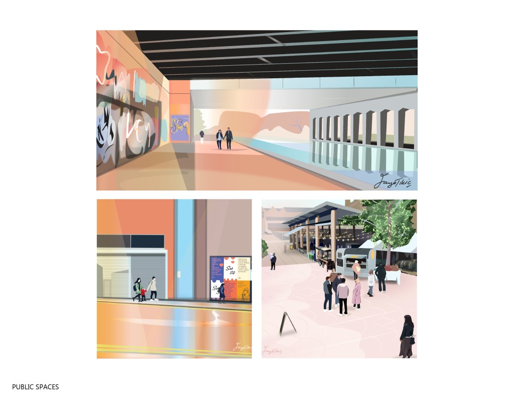
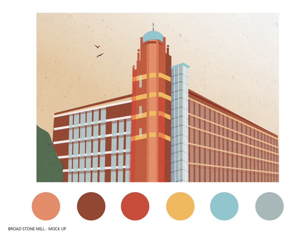
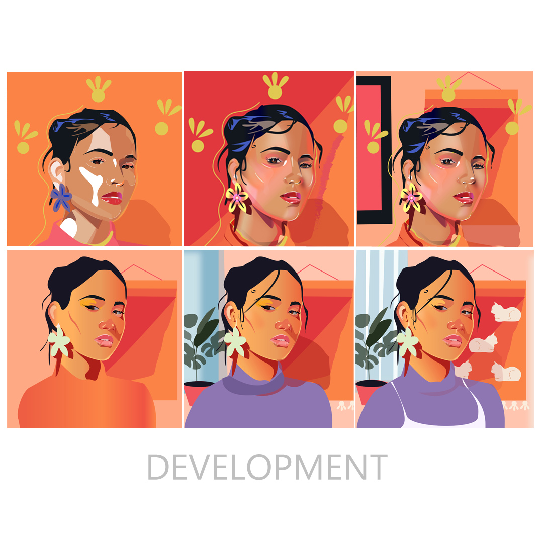
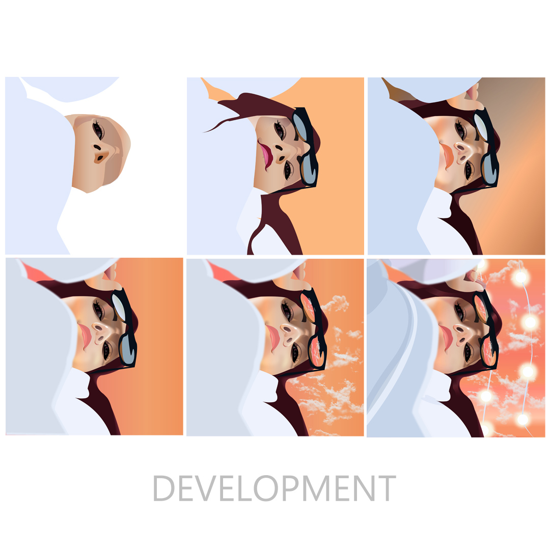
To get started, I visited the Mill with Jennie Rowe; the interior designer on this renovation. While I was here, I explored the top floor and snapped as many photos as possible for inspiration. During this stage, I refered back to the material proposed to Broadstone Mill; reviewing the style, colour and composition that was pitched. My public space illustrations and draft visual of the Mill were well recieved, therefore I was able to focus on the composition of my mock up, with the same bright, clean quality of my public space illustrations.

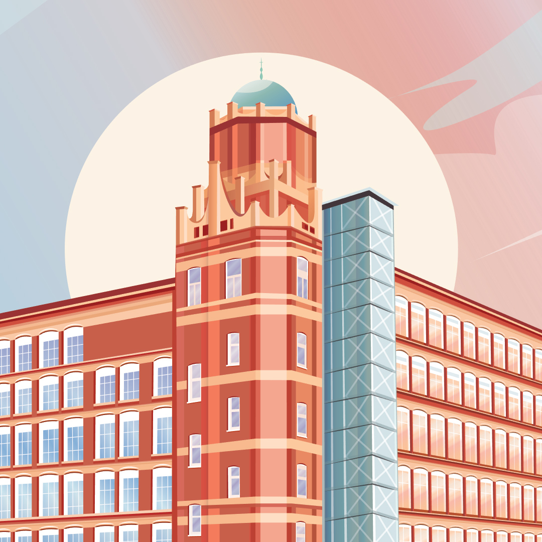
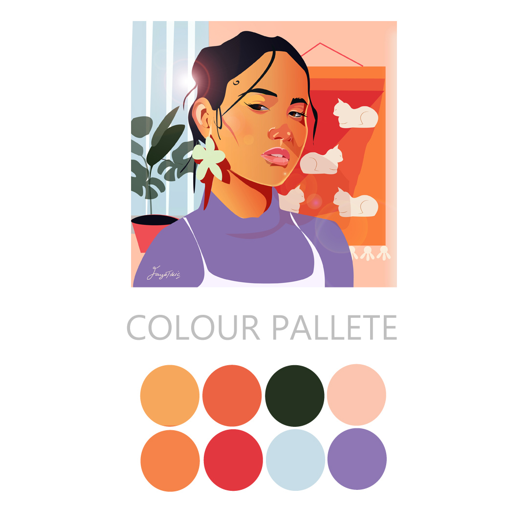
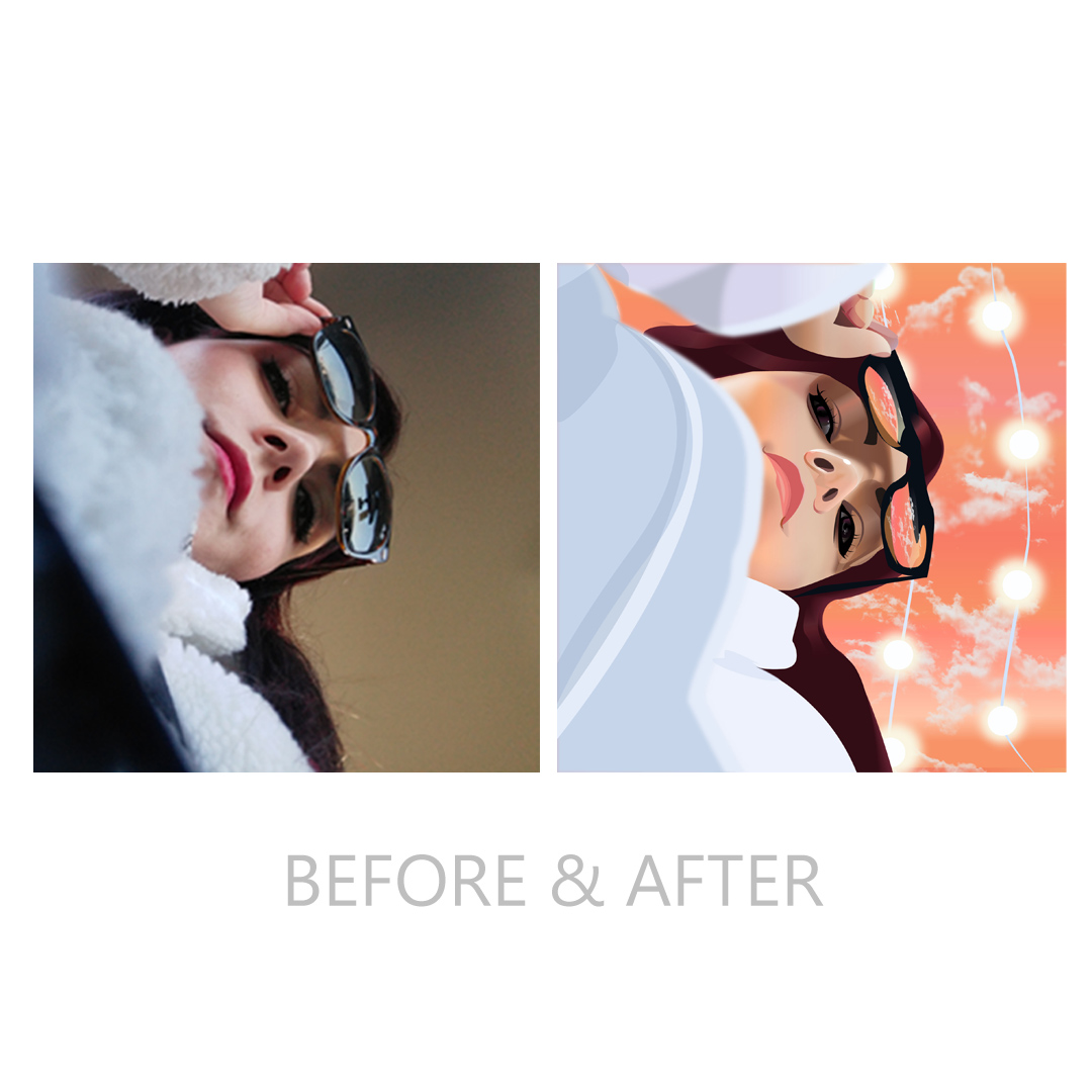
My style and colours usually channel lots of warmth, terracotta tones and open space, I always enjoy bringing in elements of light. Those who know my work, will be familiar with my feature circles, I feel this is a clever way of drawing the eye to the centre of an artwork.

GRAPHIC WALLPAPER ILLUSTRATION

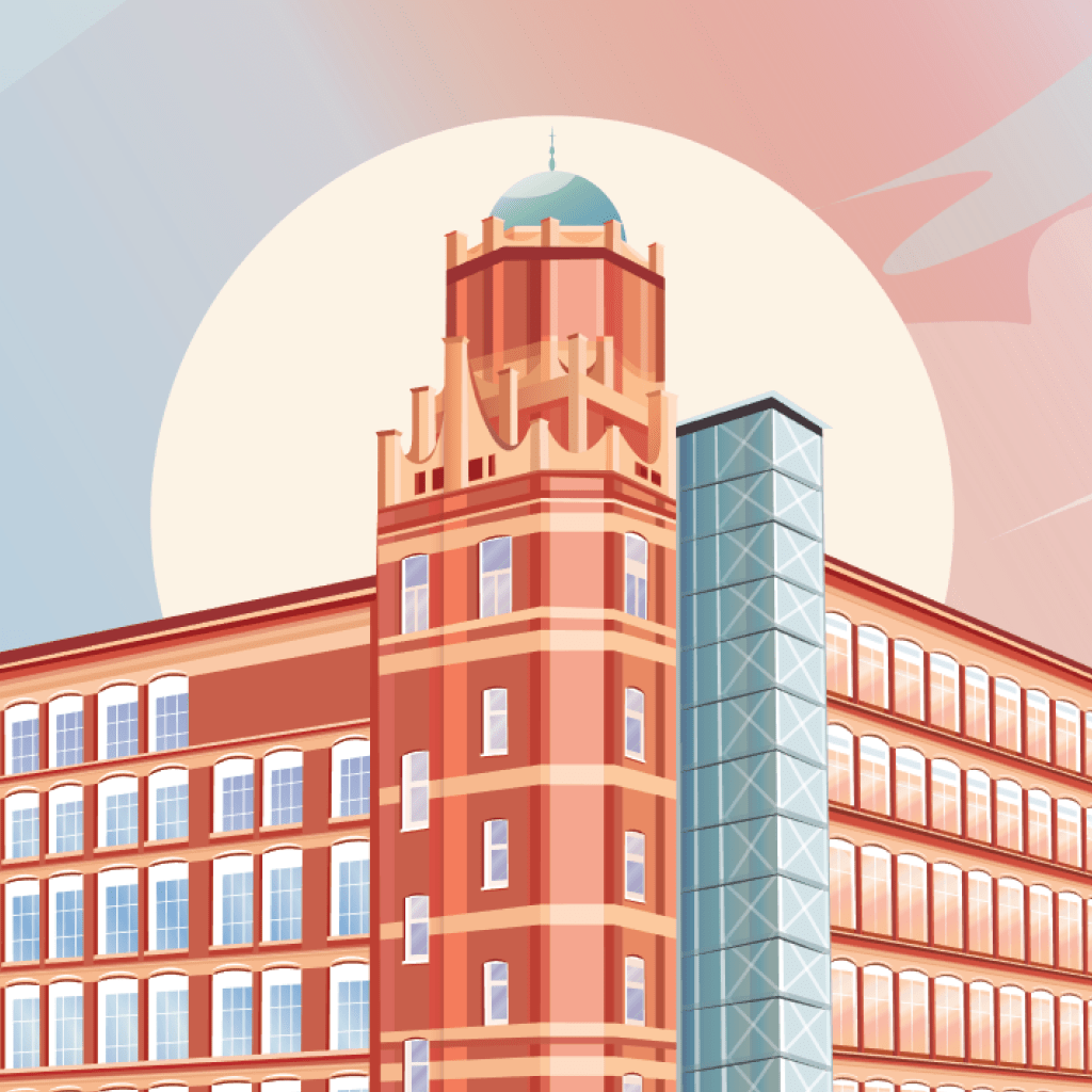
(BROADSTONE MILL, REDDISH, STOCKPORT – TOP FLOOR)

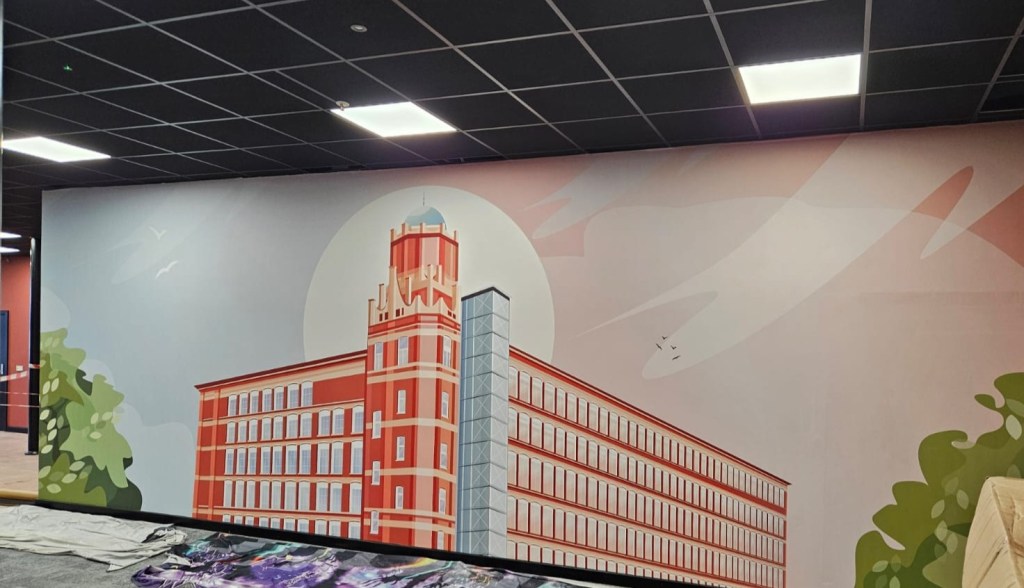
I am beyond thrilled to see this up, it took a lot of refining and perfecting to ensure this was flawless in full size (800x200cm). It was a fantastic project and even better to see it up in full glory. A huge thank you to Electric Blue Interiors and Broadstone Mill for involving me on this exciting revamp.

Digital portraits

I have been producing fine art portraits for a few years however I hadn’t tried out using digital software. Since using adobe illustrator for a few months, I gave myself a few projects to push my skills. I felt going back to basics such as landscapes, fruit and faces were a good place to start!

To get started I used some references and created my own clothing, background and styles, I found a lot of the magic comes through the lighting and gradients.

I re-started a few times while I was gaining a process, I didnt know where to start! I found producing a preliminary base was a good approach, it is just like drawing a portrait with pencils or paints. The strategy is easily transferrable, especially since these visuals are built through layers and tonal values. Once I had discovered these key points the next hard part was knowing when to stop. Light, shadows, reflective tones are endless so the real challenge is finding what is worth the layer, less is more therefore its about simplifying the visual.

SELF PORTRAIT

After producing 2 portraits, I felt it was appropriate to try out a self portrait, this time i wanted to try out a different perspective, lighting and shadows. I found it was challenging making sure the result held a likeness to myself and my reference image. Usually I dont try to make anything look exactly like the reference, since its just a source of inspiration. I am quite pleased with the outcome, I feel it really does look like me! I have been enjoying exploring a new creative realm! This practice has inspired me to get painting again so I have a new sketchbook decidated to funky fun portraits, doing both keeps my perspective fresh and open to different mediums.

WELLBEING WALKS PROJECT

BOOKLET LAUNCH

I am very excited to announce my work here is done! I have finalised and refined the booklet and map, bringing the project to a close. Since I had everything in place from my design development stages, I was able to embark on the super fun part, tweaking colour palette, composition and final details. I had a great time cultivating a soothing, outdoorsy aesthetic.

It is an exciting time to launch the wellbeing walks, and it was an absolute pleasure illustrating on this project! A huge thank you to all involved! John-paul Coe it is always a joy working on these projects and being an affiliated designer for such wholesome work. To ensure everyone has access you can download a copy at the end of this post!


John-Paul Coe, Chairman of Wythenshawe Waste Warriors

“I am proud to share these amazing images and mapping designed by talented local artist Faye Tikic. Some time ago our wonderful partners at Thrive in partnership with Our Manchester embarked on a journey to promote Well-being walks which lead by Chantel Hill and Dave have been hugely successful and supported many local residents in enjoying our local outdoors. http://www.facebook.com/thrivemcr

After the incredible volunteer work along our off road pathways by MP Mike Kane and Undercover David we were inspired to map and to help volunteers to participate in clean ups and zero carbon transport from places such as the Black Path and Blackcarr Woods. Our MP Mike Kane named the miles of pathway; โ€˜The Wythenshawe Greenwayโ€™ and we are in awe of the work achieved. We had many fellow residents young and old praising this work and it is incredible how many partners and areas of beauty you can find along the route. To this end we commissioned local artist Faye Tikic to map and illustrate this route and I can say we are really pleased with the results. These images are available to all thanks to Our Manchester and Thrive who have kindly offered use to all to promote active travel in our wards.

Thanks to Michelle Ishy Shinjin Comar, Undercover David and Kyle Dodd for the planning and route support. We couldnโ€™t have put this together without your hard work.Wythenshawe Waste Warriors have been proud to partner with Piper Hill Specialist School working with students mapping assets and all that is wonderful about our Town. Over the Summer months I will be working with all partners to have some hard copies available for walking groups and community partners to enjoy our green pathways.

Iโ€™d like to take this opportunity to share the amazing routes and links to the Manchester and Salford ramblers who you can find online. A huge congratulations to Thrive, Our Manchester, artist Faye Tikic and partners for this incredible mapping and opportunity! There are too many partners to name individually from Jean Wright, David Vyse Bell-Hartley, Lucy Makin, Barny Beswick, Joe Farrar, Richard McEvoy who have supported along this route but you know who you are and I hope you will enjoy the pathways for years to come.

Letโ€™s get active and donโ€™t forget the spade, pickers and brush and join your local community group and Thrive on your walks ๐ŸŒณ

-John-Paul Coe 2023

Get your downloadable copy here:

Portrait Commissions

PETS

Over the last few months, I’ve had the pleasure of producing pet and family portraits; this was especially busy around Christmas and birthdays, It’s been very special creating personal artworks for all kinds of people, particularly those who come to me through word of mouth, creating new relationships with wonderful people and having the special job of making something meaningful for them has given my practice purpose and meaning, I will definitely be open for portraits full time!

Starting out, I had been asked to do a few portraits but I felt I wasn’t good enough to accept portrait commissions, after some practice I managed to fulfil a few pet portraits and soon I was being asked about family drawings, I am looking forward to taking on more and improving my skills! I plan to do some self-portrait and celebrity drawings to keep up my practice, stay tuned!

FAMILY

Lovliest email ever!:

I feel very humbled and lucky to meet and work with such lovely wonderful people, this really is what life is about! Thank you to all my clients so far, I hope to work with you again in future!

Logo Design – The All Smiles Gift Co.

I am always over joyed when a company comes to me for a logo design. The below logo was for an e-commerce toy & gift shop, thus we wanted to make sure the final result was fun and punchy with a clear idea of what the business is about.

This project was very fun and it was great to work with All Smiles. Vincent supplied me with everything required, including: mock up base logo, colour scheme, preferred styles. This improved the efficiency of our work, I responded through a variety of mock up, development and final visual design boards.

DEVELOPMENT BOARDS

DESIGNS BEFORE & AFTER

On the left is the mock up design provided by All Smiles, this was created to give me an idea on what features are important, for example the “S” being a dominant element within the design, I was enabled to explore options with a definitive style in mind.

The project went very well, we were able to solve any problems that arose. These were around available fonts and the style of the ‘S’; unfortunately, the desired font was copy righted, so I was able to offer a range of free fonts, which I then tweaked to the client’s desire. As for the ‘S’, none of the fonts would produce the preferred curves, so I was able to design this freely using vector tools. These small issues were solved quickly and effectively, resulting in a smooth fun project and a very happy client.

Review: