Visual Development

I have focused on a range of subjects drawing from my theme results, looking at nature and colourful inspiration. I have a focus on plants specifically bonsai’s and bamboo but I wanted to further work with an idea of minimalism, peace, zen and nature so I went on a few trips. I decided to focus on water as it links in with the idea of continuous change and waves, flow etc so I visited the seaside in southport and a lake in bartington. I referenced my artist research here channeling the inspiration and drive into producing my own material to work from.

Photoshop

I’ve been using photography in photoshop to expand on my experimentation, using my plant photography, I was able to find a cut out tool and remove its background, using layers I then repeated the image changing the hue, exposure and saturation in each. I then played around with using the word Kaizen in Japanese, using colour blocking to further a graphic design aesthetic. I was pleasantly surprised with this as it started from a picture of bamboo and looks like a design flyer. I like the finish of this however I don’t think it is minimal enough, however I feel if I was to place blank boxes over the leaves this could be a beautiful activity page.

Zen Focus

I decided to use the same effects frommy pop art digital illustration here and in my later work, I found this added such a modern air to a modern image, almost as though it was black and white and has been brought to life and recoloured, I could perhaps use this approach in my activities, giving them a photography to colour in with some examples.


Southport Beach – Photography

20190420_131504[color]

20190420_131504[colorblue]

I have been exploring the potential of photography by capturing light scenes of people in nature, combining my initial thoughts of portraying people in pop surrealist styles. I wanted to explore this as I have been using the same effects with my illustrations, i feel this holds a better quality in that they are cleaner, brighter yet just as creative.

20190420_13203beach4accentedge2.jpg

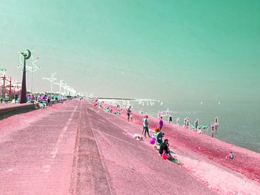
After I had played around with hues, I decided to add a filter, I found I could almost digitalise my photography to the point where it could look hand drawn or painted, I had used the glowing edges here and it seems to have added a quirky surrealist feel, I want to try out exploring animating photography, I feel using the cut-out filter will do this as it breaks forms down into shape and colour, portraying the style of a painting, I will begin exploring this further with other photography.


Pattern exploration

Using the idea of patterns from a suggestion in my questionnaire results, I decided to play around with repeating nature, using plants and colour to produce a variety of visual exploration. I found that this repeatition creates an almost snake skin effect, I really like the outcome as it embodies nature, structure and contemporary style, the black and white is my favourite though I must go in a colourful direction and less busy as these are highlighted in my visual feedback.

Result Response Work

Responding to feedback

After I recieved back my completed questionnaires, I was able to understand what people find most appealing and in context with the magazine, it seemed that minimalist was a popular choice as well as nature, however it was apparent that pop culture was the most inspiring and so I have been responding experimenting with this feedback, using my illustrations in photoshop, I was able to collate the three themes into one, expressing a minimalist theme that cultivates a juxtaposed visual of pop culture and traitional japan, so my final theme is – Minimalist pop nature

Illustration Experimentation – Photoshop

I began using my theme visuals in photoshop to begin expanding on my feedback, I played around with pop and nature, creating different colours and variations like warhol. As I’ve been becoming more confident on Photoshop I have begun to use layers and new tools, I found by using the select tool you can select areas and change the filter, colour, brightness of just that section, so I began to play with this on the lower images, combining new found techniques with filters and hues.

I used the fresco filter to start off, darkening the aesthetic, I then selected boxes within boxes, altering the colours and saturation in each untill I had bright colourful result, using layers to control each feature.

Photography Experimentation – Photoshop

After recieving my results I looked back at my artist research and felt inspired to use photography, looking a Ren Hang, I wanted to explore contemporary nature photography and so I began editing some images I have from the allotments and gardens using suggestions from my feedback. I decided to explore the idea of using pattern and colour blocking, I have been reading an article on Japanese graphic design and it is reccommended to explore colour. Below I had panel hues down the images and I had repeated the image on the top right to explore pattern, I feel these are interesting effects, I like using pop with photography as it looks interesting and inspired.


Pattern illustration – Photoshop

I decided to keep trying out patterns with my other nature work, exploring pop again by altering the hue and saturation, I feel this will be the technique used to bring in a feel of pop culture, however I must be careful with the saturation as it can make it unnaturally vibrant.

I found it quite simple in altering these howver it was hard to chose which colours to save as there were so many options, I feel it this process would work well with the idea of pop culture and minimalism however I feel it would be good to explore other options further perhaps using the same effects here with more primary photography.

Results: final activites

My activities workshop went well, I was able to collect the feedback I need to narrow down the most effective and favoured activites for development. These were activities four, five and seven: learning a new language, mindful colouring and drawing a landscape. I found the most favoured exercises were by individuals between 18 and 30 and mostly female, I feel I could rebalance my appeal through quirky fun visuals though I now have a clear direction in target market.

Below are some results:

Activity One – outcomes

This slideshow requires JavaScript.

This was a successful activity, everyone was able to follow the instruction and visualise their breath as a drawing, the feedback from this was positive and helped everyone relax and feel uplifted, I found the same from my results from my presentation in Feburary.

Activity four – outcomes

This slideshow requires JavaScript.

Activity four: how to imagine and paint a landscape, this activity was one of the most successful, each individual created their own landscape and they were all impressed with their results, most took them home but I was able to keep some good ones. I feel this was mostly fun as they used basic steps but everyones came out differently, I feel this would be a good one for the magazine.

Activity Six – outcomes

This slideshow requires JavaScript.

Activity Six – how to draw an eye: This activity worked well however not everybody was happy with what they made, I found that people became more up-tight and worried about what they put on the paper, the best feedback was from the people who surprised themselves and felt good about what they had drawn and learnt.

Activity seven – outcomes

This slideshow requires JavaScript.

Activity seven: mindful colour also went very well; I already had the paints out from before so I allowed everyone to use up their pallets in this exercise. This was one of the most favoured exercises and helped everyone express their creativity, I had a participant mention the fact that if this was in a magaizne not everyone could use paint as they may not have access, I felt this was helpful feedback and has made me think about creating illustrations for colouring instead or as well.

Working Out Results

logging results

I used this chart to log my results, each chart it one individuals feedback so I logged twelve. I then counted up how many individuals voted a certain number for which exercise and turned that into a percentage.


Questionnaire

My results have given me direction in aesthetic, I provided four themes and it seemed that pop culture, nature and minimalism were voted highest and almost came won, however minimalism was voted most in context, nature was most favoured and pop culture was most inspiring so therefore my final theme is a combination of the three. I gave the participants the option to suggest and reccomend other ideas and themes for further experimentation and so I will now begin exploring these results visually and practically.

below is my official report and results:

official results report

Questionnaire Results

Workshop – Plan

Market Research

I developed a range of activities for my market research trial and constructed an orderly plan for the workshop. After a group tutorial with my peers, it was recommended to explore some more art related activites which I thought was a key suggestion; I was becoming so consumed in the philosophy of Kaizen I was losing my focus on art therapy. This helped me redirect my focus and I was able to add two more activites for trial creating a total of seven potential exercises.


Workshop Time Table

plan

I will be conducting this workshop in two days time and have been preparing feedback sheets and different research methods, I feel it would be good to keep the work created however I feel it would be most fair to give them the option to keep their work as I have the results I need. Below is the first page of the feedback sheet.

e.g feedbackform

Questionnaire

I have also developed a questionnaire using my developed themes, this will help me narrow down an aesthetic for my audience and encourage a path of finalised development.