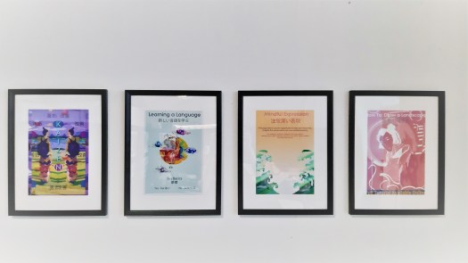
Magazine Design
Using photoshop I began playing with my edited visuals and photography experimenting with effects I have learned from my online course. I kept in mind key factors from the Japanese graphic design website like lots of colour, gradients, blocking and text. I like each design but feel they are too dark and lack my desired quality – calming quirky colourful.
Drawing on primary photography scanning it in and editing

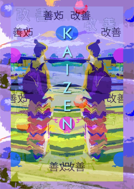
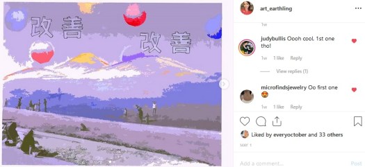
I wanted to further my experimentation so I decided to print out some of my photography and visuals, adding shapes and font from my speficiation doc, I wanted to involve a feel of traditional Japan which is why I added the mountains in the back. I used coloured pencils referencing my pintrest board as a colour pallet and using a rubber to remove ink, forming glowing outlines and highlights. I then scanned this back into photoshop to maximise potential.
I expanded on these by playing around with colour editing tools and the cut out filter, this helped break the tones and produce different styles when I changed hue. I like the effect of these designs, particularly the pastle colour version as it echos a sense of Japanese graphic design which I feel is a success.
Photography and illustration
– sharpie, photography and photoshop
Here I blocked out some areas and highlighted around them, I felt this highlights a geisha form, and draws the eye into the centre. I furthered this by outlining her in black and the other figures in pink to play with pop effects. This works really well and looks well finished, I like the shadows and complementary colours, I used this in my first cover design and felt I needed to express more independence and individuality so I selected a more appropriate image from my photoshoot.
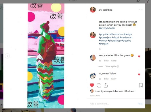
I used the same ideas as earlier, applying shapes and font in different styles, I really liked the impact and effect but I preferred my the composition from another photograph in an earlier post, I felt this result isn’t as simplistic and calming as the one by the canal.
I decided to combine these ideas using my preferred photo and same manipulation, I decided to try this out digitally and feel it looks much cleaner and well designed, though I do like the hand drawn aesthetic, I may combine these ideas further however I am happy with the above results and experimentation.
