Developing page visuals
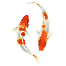
Fish
built layers of coloured pencil, watercolour and fine liner
I began this experimentation with coloured pencil as I felt I could control the colours well, as I went through this process I would scan the drawing into photoshop to see how it looked in different styles, this way I could see what I wanted to change and achieve that.
Above are the results from the coloured pencil illustration, I felt they were cool but lacked a polished air and needed a softer style so I attempted the same design in water colour. After scanning it into Photoshop, I found it lacked outline and form so I added a thin outline with fine liner. I found this held a much neater, brighter visual than my previous designs, especially when edited – I found they looked softer and more professional. Now I had my final design I was ready to experiment with colours, tools and styles, these can be seen in the slide show.
This slideshow requires JavaScript.
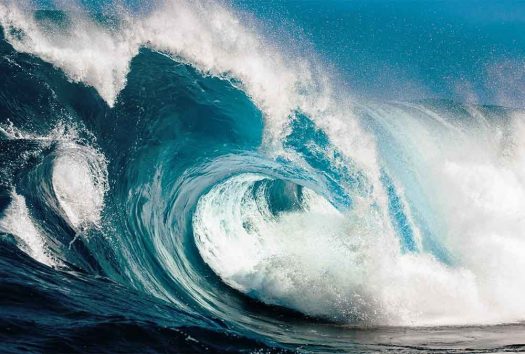
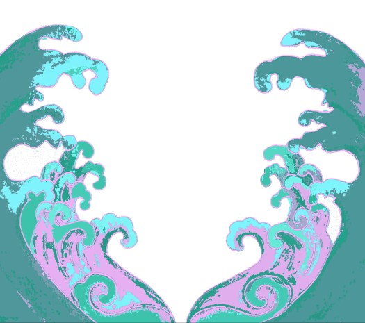
Wave
Watercolour, coloured pencil and finer liner

This design used water colour and coloured pencil

adding fine liner to bring in definition. I prefered this as it helped the colours pop and become more vibrant.
After producing my first activity illustration, I had in mind what style and process I should maintain, I fist created my waves in watercolour, building layers of tone with coloured pencils. After scanning it in, I found it lacked definition so I added the fine liner. I found this instantly improved the illustration and matched the fish well, I then began to experiment with colours, tools and styles in photoshop which can be seen in the slide show below. I found it difficult to identify which style I preffered so this helped me visualise my options and note which tool and style was used to achieve it for final development.
This slideshow requires JavaScript.
I tried out a variety of styles, filters and tools, exploring colour range to bring in a feel of pop to support my chosen theme. I liked the body of visuals from this though I felt these looked more so like childrens activity page, targeting a younger audience than desired.
I found that the style “cut out” works best for the illustrative and photographic work, I have been experimenting with it for cover design and feel it pushes the graphic style of the outcome, I like how it breaks the image into colours and shape making it look like a digital painting – This has been a very beneficial journey as this step will be part of the final process for content ilustration and cover design.
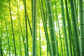
Landscape
After developing my steps, I thought about adding to the framing and display of the page, adding detail to the steps by editing the outline and positioning lines. I feel this looks much better than just a box. I then thought about how empty and colourless the page and how I could complete the page and visuals.

I thought about the visuals and felt it would be nice to involve more imagery as the steps will be black and white. To do this I felt using examples of what could be done with the result would be beneficial so I did them in a variety of mediums:
– sharpie, watercolour, fine liner, pencil and colours pencil.
Examples for the page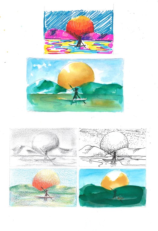 I feel these will help add to the page and work well for inspiration though I do feel a little unsure on how I will compose the image in a minimalist and creative manor, I may need to illiminate certain images or rethink the design.