Guide-book Illustration

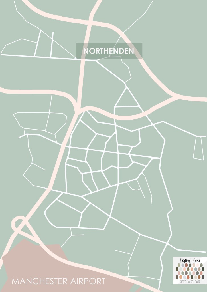
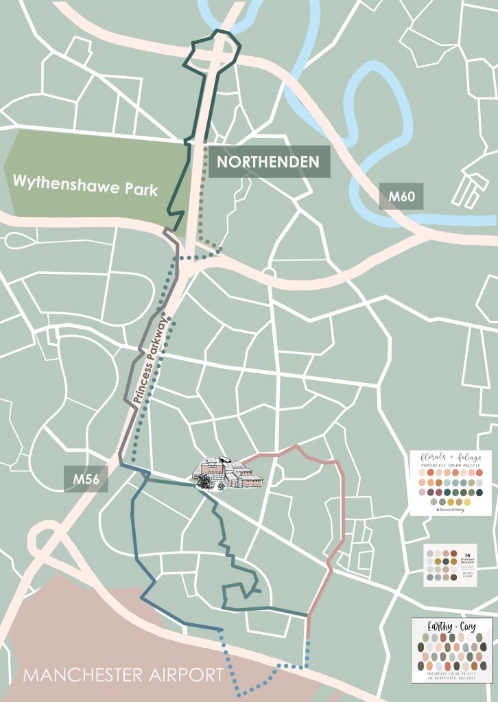
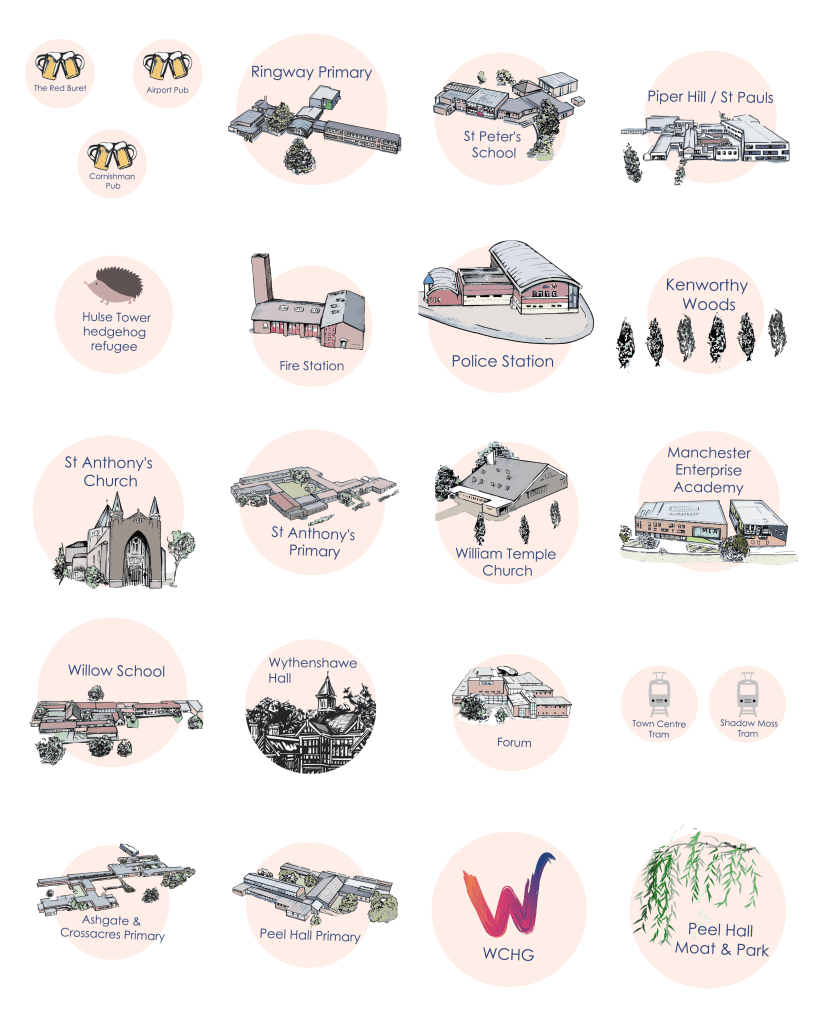
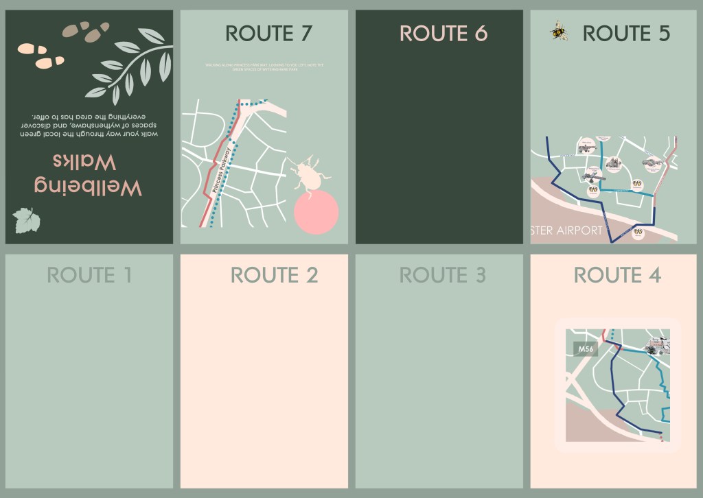
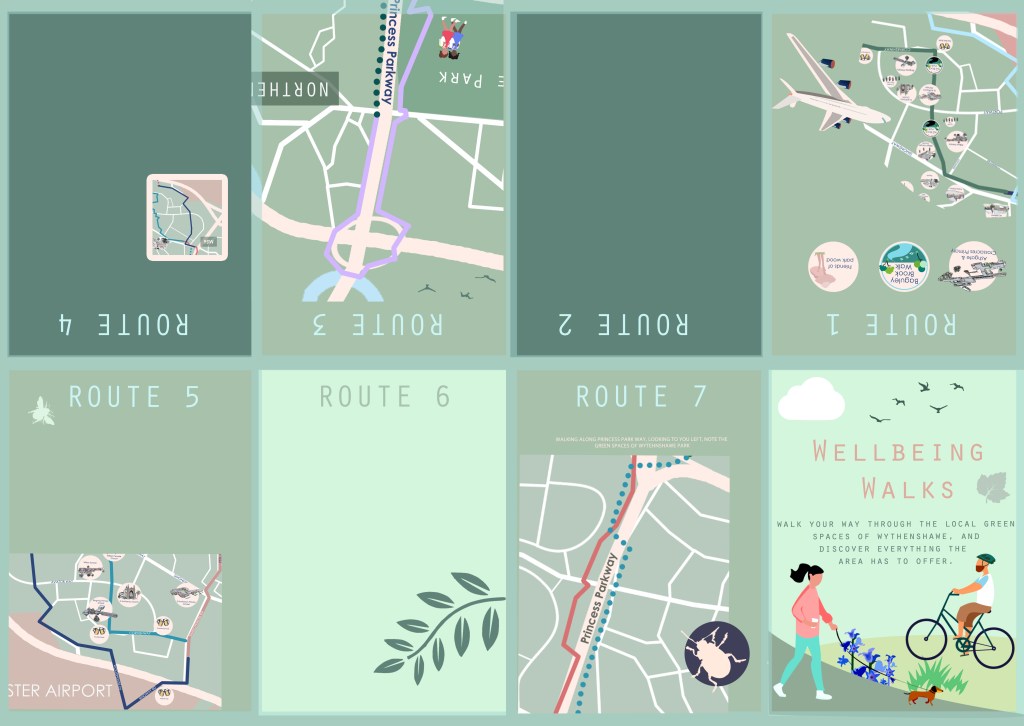
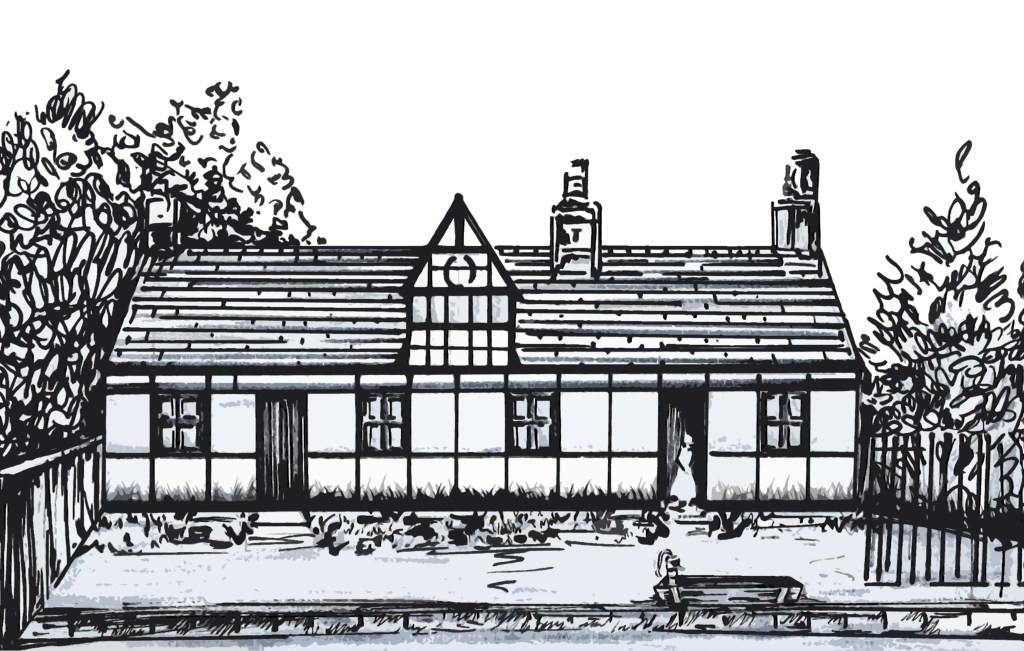
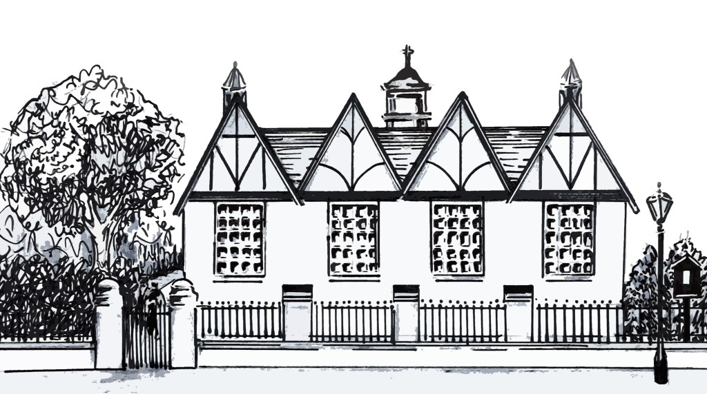
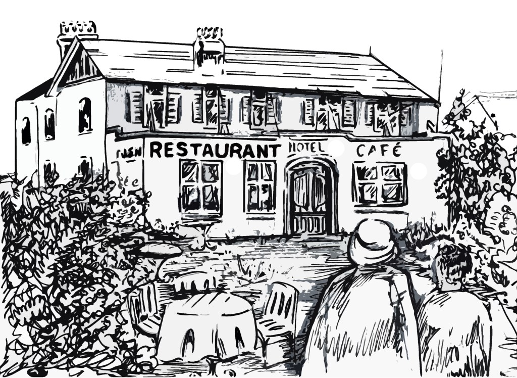
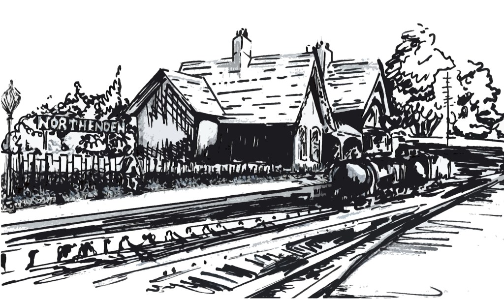
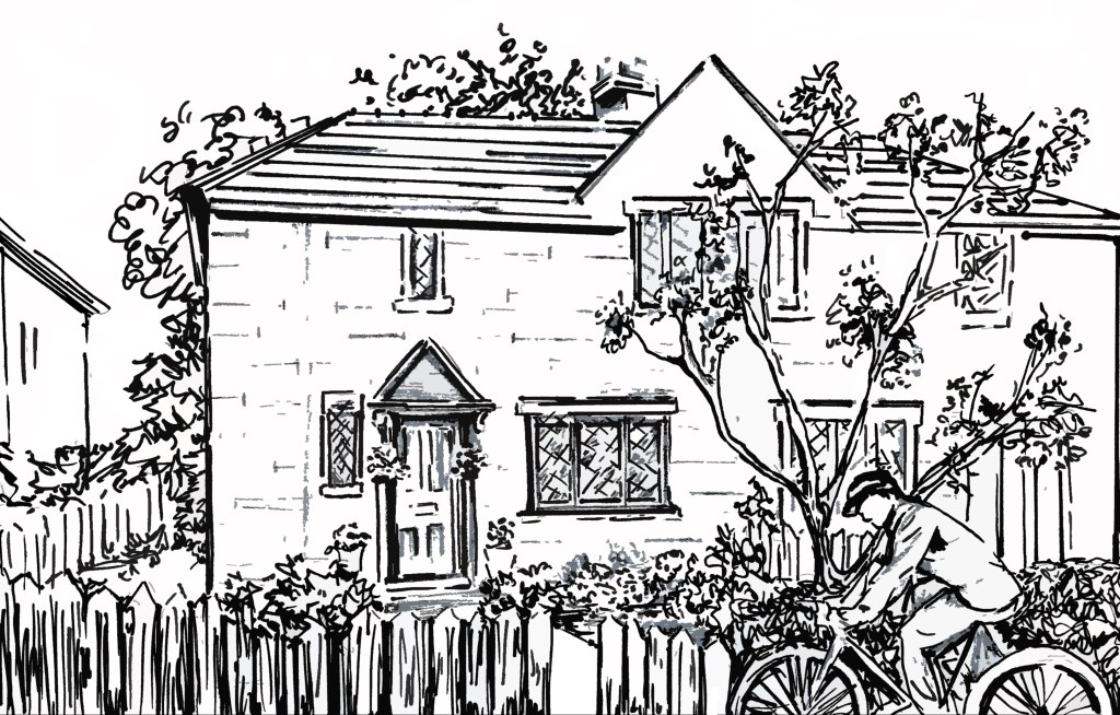
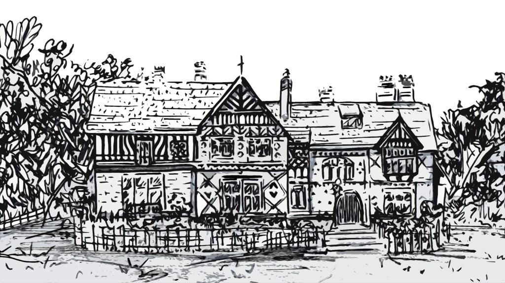
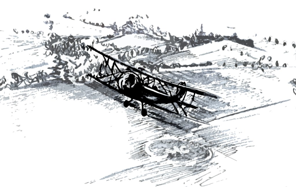
Northenden’s Historic Guide-book was commissioned by Now-Forever Heritage CIC after I won their “village by the river” competition in 2019. My responsibilities on this project were illustrating past and present buildings along-side designing the guided walk’s map. This commission involved lots of archival research, tracking down images and memories of demolished buildings so I could illustrate them for the book.

The illustrations and map were produced through a combination of sharpie’s and digital, producing marker drawings and base map then re-working on digital programmes such as photoshop to clean up and finalise ready for publishing.

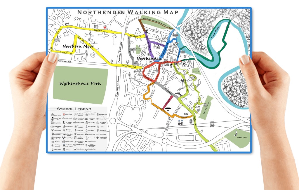
This was a fab project working closely with the wonderful lead project co-ordinator Stephen Evans, organising daily meetings, mapping out the journey and walking the routes during its development. I am still elated to have collaborated on this and even more excited to have been credited co-author for such a substantial contribution. I hope to do more for different local areas.

Thanks again to Stephen Evans & Now-Forever Heritage CIC for involving me on this project 🙂 I’m excited for the book launch! 🥳

Portrait Drawing

I have been keeping a sketch book to practice figure and portrait drawing for some of my commissions, i had never been much good at drawing faces or people but I’m pushing myself to learn new techniques, I recently got the book “Drawing Perspective: How to See It, how to Apply it” by Matthew Brehm, Its tough getting your head and hand to act as one so I am looking forward to applying some of Brehm’s teachings.

I enjoy producing portraits, especially capturing expression and moods. The challenge is identifying key features, lines and shapes that cultivate a likeness of the individual. I have been returning to this practice for the past 6 months and I’ve been lucky enough to have 3 portrait requets so I am able to practice daily.

Candle Making

Last Winter 2021, Dom and I became obsessed with candles and how to make them. He surprised me and went all out on collecting the gear: kilo of wax chips, scents, colours, moulds, jars and wicks. He had also sacrificed a whole space in one of our cupboards to accommodate, so I knew this would mean business. On a snowy day it felt perfect to stay in and ruin the kitchen! So we did just that.

I use to love candle making, I’d made them previously to raise money for exhibitions and events, though I had never done them professionally. We watched a few tutorials and read up on the art of candle making, but the quality of results definitely comes down to experience. There were a couple of problems to start out, such as keeping the candle lit and releasing the scent, but after trial and error, we found it was mostly down to patience. We were too eager to light the candles, usually moving them while setting and lighting them within a few hours of making them, so avoiding these tempting pokes and paying attention to temperatures have really improved the results.

Since it was getting towards Christmas, we thought we could them into gifts, so we went mad collecting old jars to make as many as possible. They went down a treat and we are thinking we may do this as a tradition.

Wellbeing Walks Brochure

One of my latest commissions is illustrating a wellbeing walks brochure; this will demonstrate a range of cycling /walking routes from Manchester Airport through to Northenden. The aim of this project is to enoucrage everyone to benefit mentally and physically from the wonderland of walks around the local area, while celebrating its variety of greenspaces, bio-diversity and local assets. This project is funded and commissioned by Thrive Manchester and partnered with Wythenshawe Waste Warriors, I am thrilled to be the affilated designer on such an uplifting, positive project.

Map Design

To begin map design, I began by drawing up the roads, Motorway, and River Mersey using satellite’s /google maps for reference. I was provided helpful material for placing in walking routes to begin laying a pre-liminary foundation. To keep my document in order, I have groups for all catogories of layers, e.g. zones, roads, symbols. The process is quite tricky and meticulous but I enjoy the challenge. I have great feedback and help on the progress from John-Paul Coe which keeps the work running smoothly.

Symbol Design

Once I had a base map and routes in place, I was provided with lists of landmarks for each walk, including parks, pubs, transport etc. To make symbols for these, I have been producing a range of illustrations and key features. There will be an estimated 50 symbols to illustrate so theres lots to consider in ensuring everything is legible.

Brochure pages

Before I thought about producing the map, I considered the reverse side, and how this would fold and be divided up. I mocked up a few basic outlines for printing and folding; this helped me trial and error sizes and provided an indication on how to scale content within the stages. Once I had a general idea of how to produce the brochure itself, I began mocking up the map and content for exploration. Myself and the funders are pleased with the progress so far and I am looking forward to furthering its development.

The Metahumans – Drafting The First Issue

My client had kindly provided me with some very helpful material to get drafting issue 1. These were storey boards accompanied by written plans consisting of 202 scenes. Getting started was the hard part, but once I got going it came together quickly. I am excited to continue producing issue 1, there is nothing better than enabling the clients imagination on paper; sending my designs over is always something to look forward to.

To begin, I correlated the storey boards with written plans to understand the depth and details at play, then started imagining the first few on paper. Using a range of pencils I drafted a rough outline of what I had visioned, once Mark and I were happy enough with the illustrations, I began developing it photoshop.

Since I have never worked on a comic before, I started to research the fundamentals and how to go about them. To neaten up the drawings, I used the digital eraser and exposure settings in order to brighten up/clean illustrations. When framing the scenes, I placed a white layer over my page and set it to 50/50 transparency. I could then cut out a perfect window for the illustrations, which helped clean up the sketchy lines. Next I developed a range of speech bubbles and text in order to bring the first few scenes to life.

Its been exciting bringing it together, I look forward to learning more and developing the style, format and identity of the comic at a high standard.