JEYDA’S TURKISH KITCHEN
There are a few stages to designing a logo, but development is one of my favourites. I enjoy harnessing potential and exciting the client with visuals for their company. This project is especially exciting as it is for my sister’s incredible street food business “Jeyda’s Turkish Kitchen”.
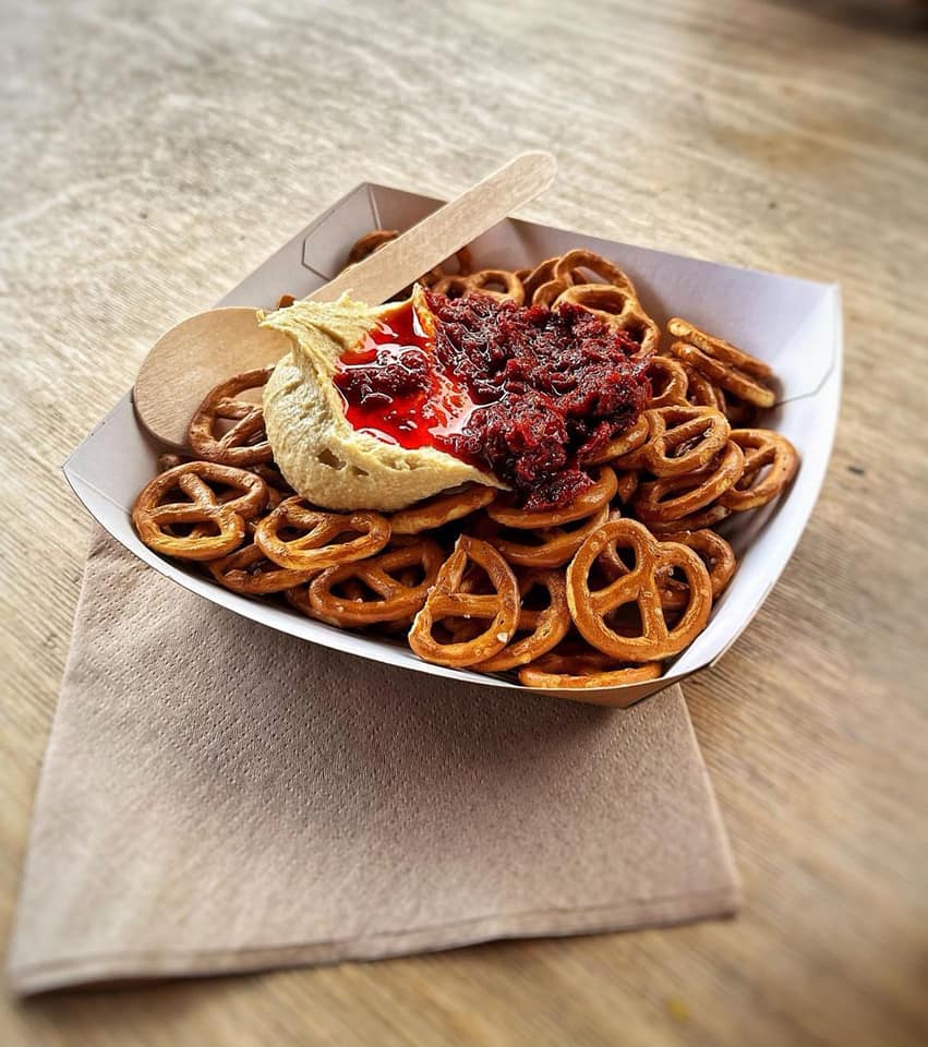
To begin establishing this food brand, we discussed business direction and company ambition; understanding the business aims, meant we could develop a timeless logo that would support the street food brand, while complimenting the business’ expansion to deli cafes.
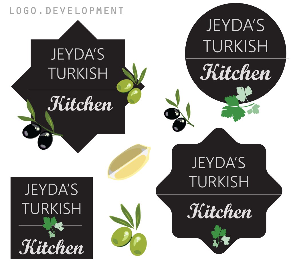
To get started we explored different aesthetics and began to narrow down what graphics, themes, colours would maximise potential. I produced a few mood boards to kick off and soon we had the above board to begin finalising.
PACKAGING DESIGN
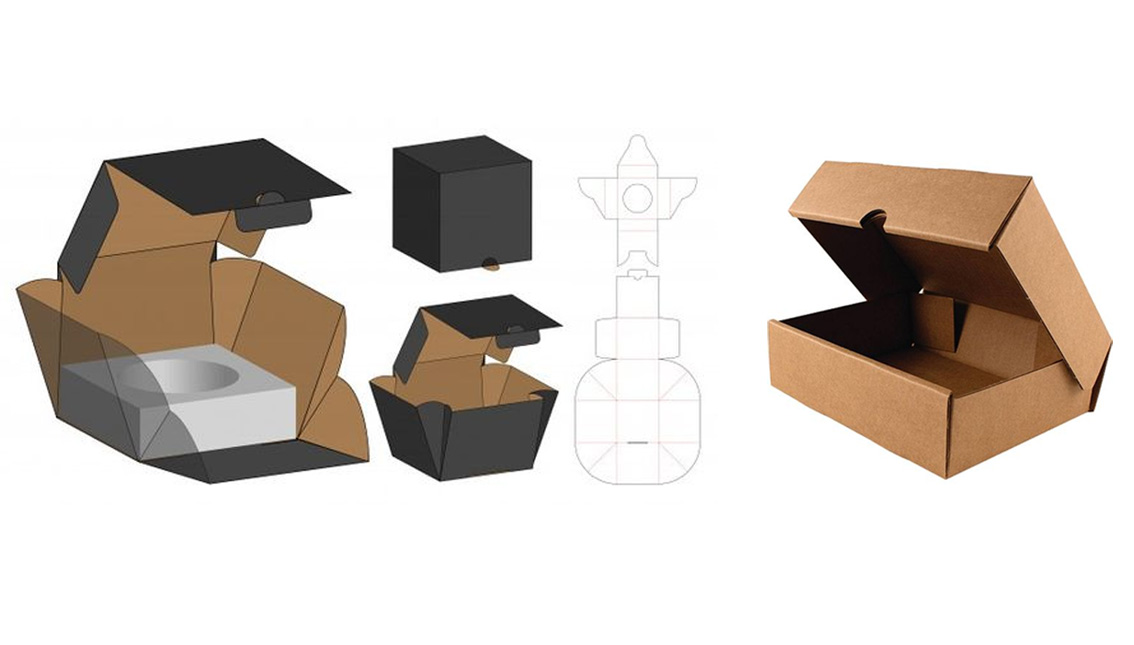
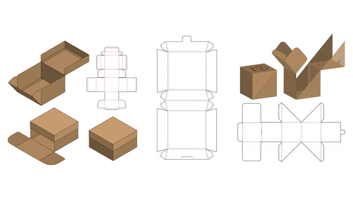
Once the logo was underway, we progressed to packaging design. We explored an array of options considering any potential issues concerning the food, portability, freshness as well as budget.
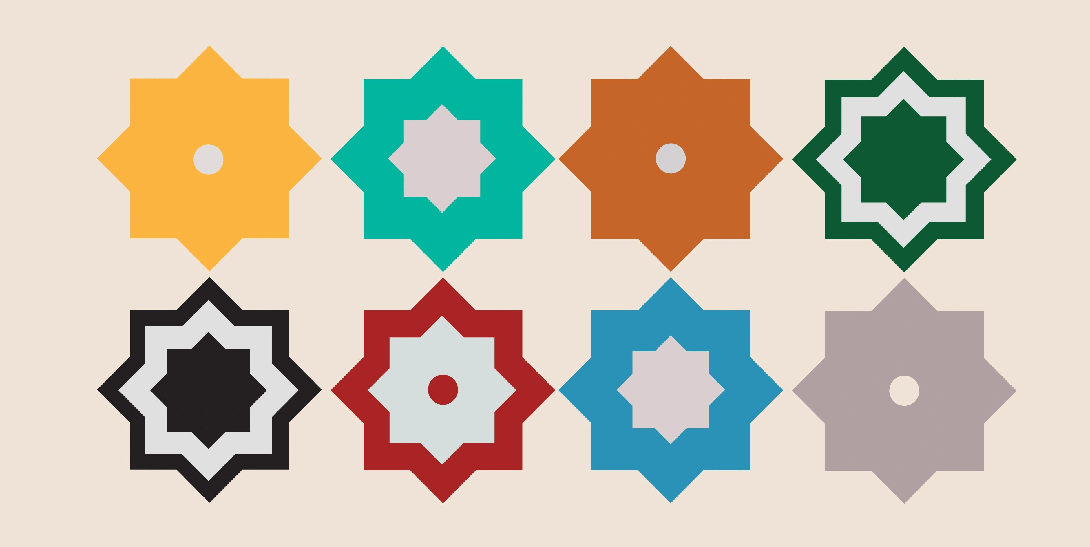
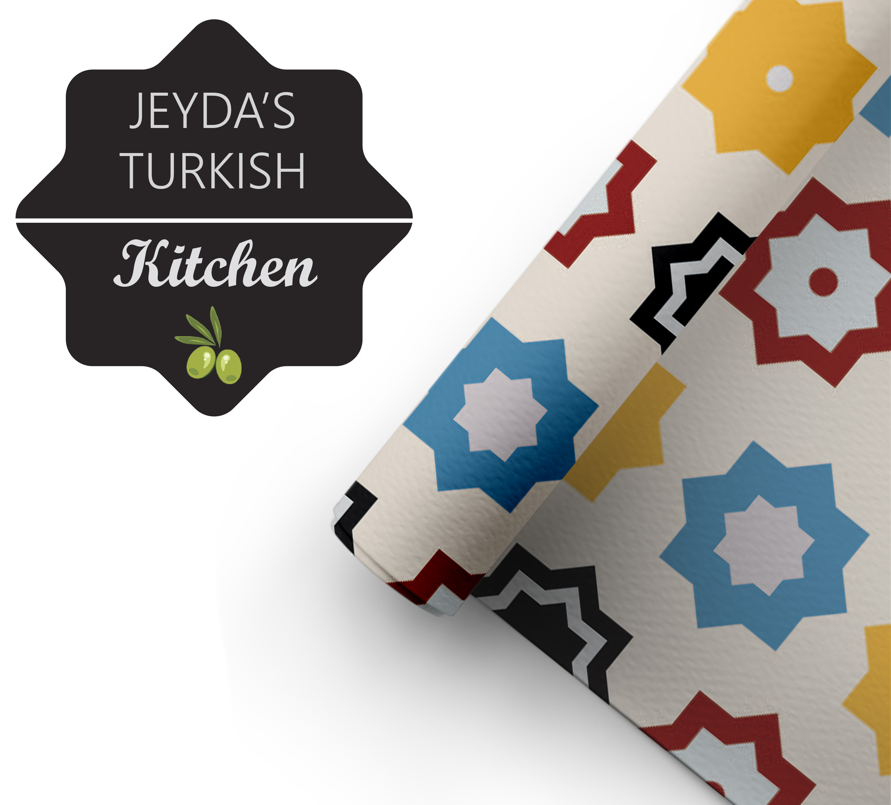
Once we had this in mind, I was enabled to cultivate appropriate development to guide the designs; I looked to a range of Turkish and middle eastern artworks, filtering through reoccurring elements such as pattern, stars and organic mandala design. I felt the classic eye design could be referenced in the sense of adding an iris to stars. This would nod at a range of influences while developing something subtle.
INGREDIENTS FOR A TASTY PATTERN
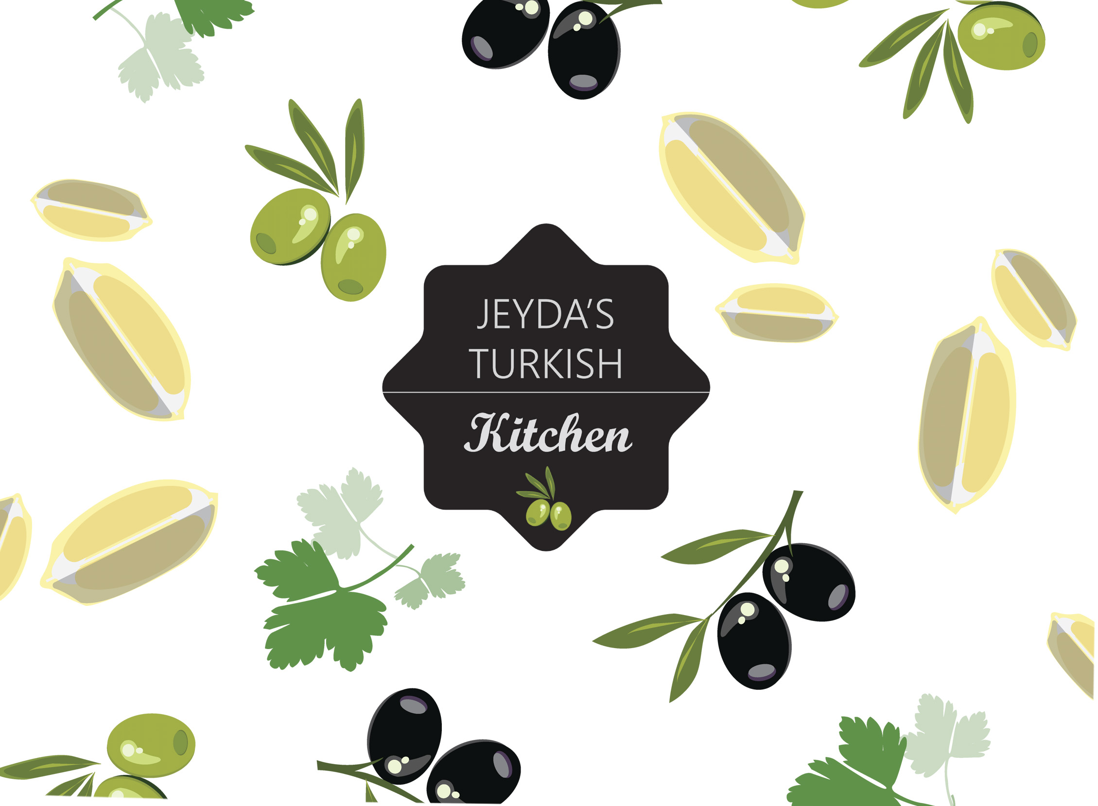
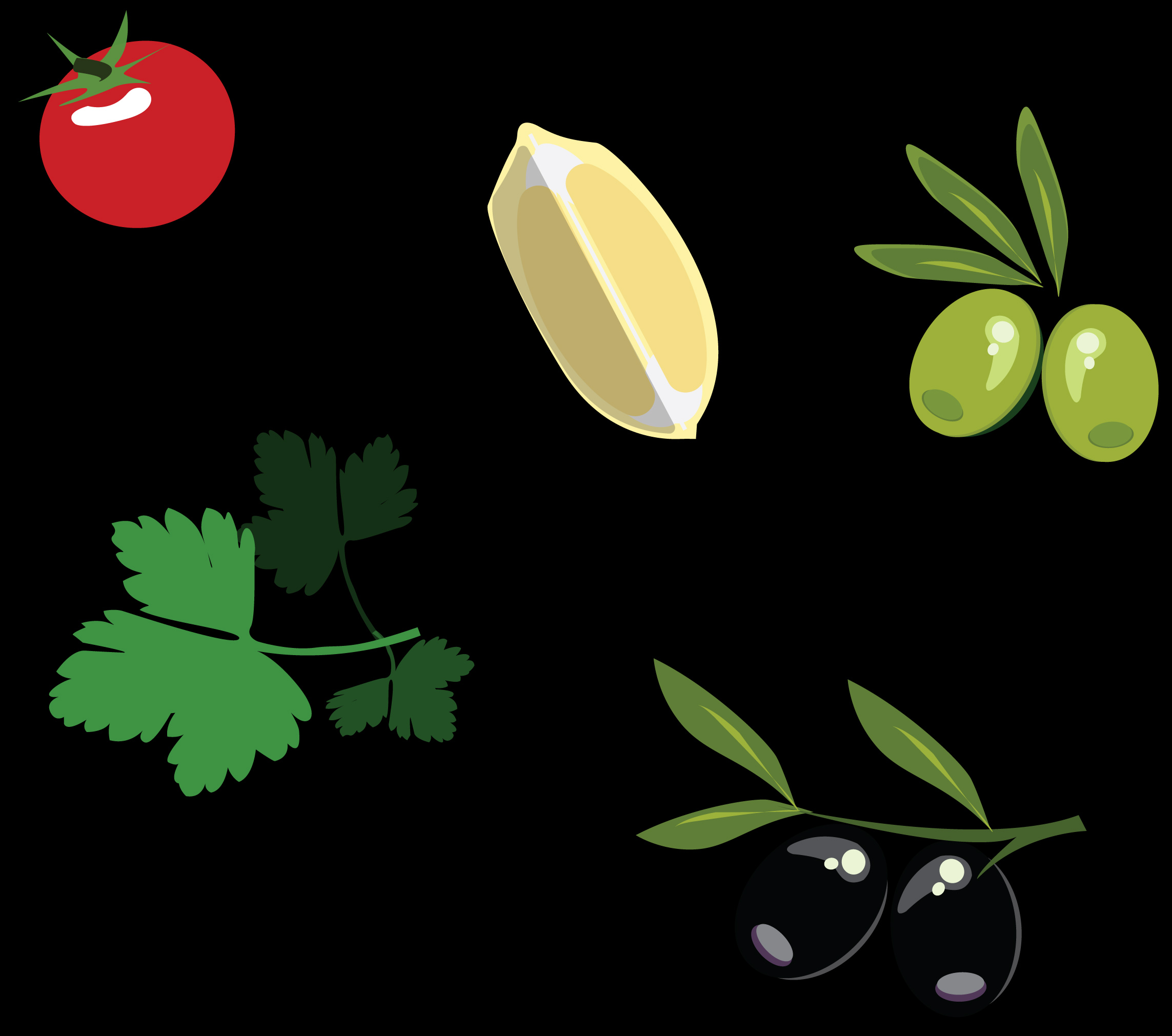
During this progress, I furthered exploration in hand with the chef side, focusing on food inspiration. To respond, I generated some key ingredients used in Jeyda’s cuisines e.g. coriander, olives, lemons, tomato. Though the progress was good, it wasn’t innovative enough for a street food brand. With this in mind, I worked on finalising something with more bite.
FINAL DESIGNS
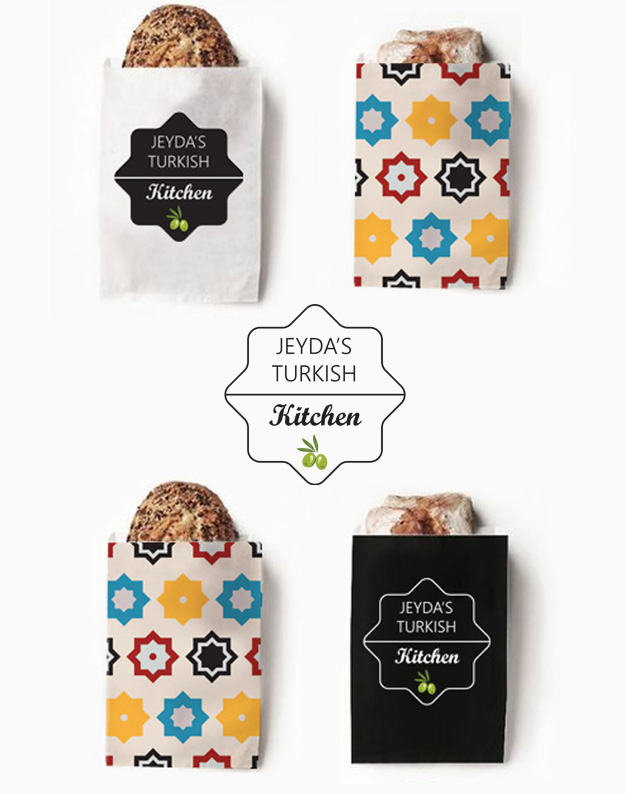
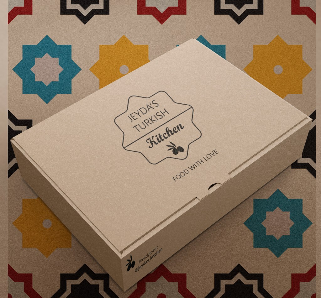
The final designs are minimal and simplistic with a strong foodie edge, we developed a final logo in two formats as displayed below. I chose a bold colour pallet, this was inspired by the bright, mosaic Turkish lamps/lanterns, they are mesmerising and eye catching which is exactly the impact I wanted to draw on.
PACKAGING: BOXES, TUBS, BAGS, WRAPPING PAPER
All designs are for different applications; I made sure to reverse the logo so it could be used for stamps and for any coloured packaging while keeping the original for stickers and print. The designs are expandable and transferable to aid the business’ development. It has been great working with Jeyda, I am excited to be her affiliated designer!
