Cover Design Development


After creating a body of potential cover design, I began playing in publisher with some of my best edited visuals. I had difficulty chosing wich colours to go with but I started with the yellow and green as they most popular and preferred on my instagram.
Instagram research
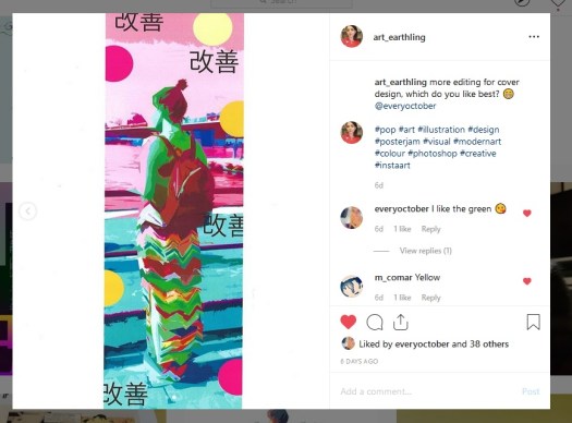
I used instagram a lot to help decide on which designs to expand on this was a very helpful source for public opinion and input.
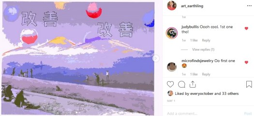
I decided to combine the most favoured works and began exploring this composition, placing the mountains and sea landscape behind, I feel this adds depth and furthers a place of nature. I played around with bars of shade to represent steps althogh I felt this closed of the design. I also wasnt fond of the colours as they dont speak pop culture to me, I felt they look quite ghostly and eerie though I do like the purple undertones.


I then thought about using a similar design but in yellow like my very first mock ups. The yellow was the most prefered on instagram so I felt this worked out well, mirroring the designs with the landscape behind
Final Design Development


I spent some time developing this design, I really liked the yellow and purple as they are complementary colours, I much prefer this version of the design as it looks more solid and relative to my themes of nature, minimalism and pop culture.
Final Cover Design

