I continued developing my ideas and visual work after repsonding to artists and primary research, I decided to further explore paint, print and textiles.
Painted Illustration
I wanted to further explore paint as I only lightly used this in my previous work, I wanted to continue playing around with soft colours and effects attemtping to work up a feeling of nostalgia and time.
I used brusho and acrylic paint to create this piece, I wanted to evoke a feeling of memory and nostalgia. I have been throughout the village of northenden my whole life, this piece draws from my memory of the village. I imagined this piece – applying my experience in the village to the canvas capturing the gaps in between with my memory with emotional nostalgia from when I travelled through the village as a child. I feel this painting provides this sense of imagination. I do feel next time it would be important to ground a sense of the village through earthy tones and colours from by the river and in the village.
Here I used mixed media, a background of brusho, a fore ground of acrylic paint and a final layer of sharpie. I used these methods to play with depth and style. I am pleased with the feel of this piece as it reminds me of traveling through the suburbs of the village though I do feel that it lacks a solid sense of place.
Printing
I developed a design when I came up with the idea of printing, I wanted to involve ideas of community, travel, transport, life, past and present. I created five designs and selected the one I felt would look the most aesthetically pleasing.
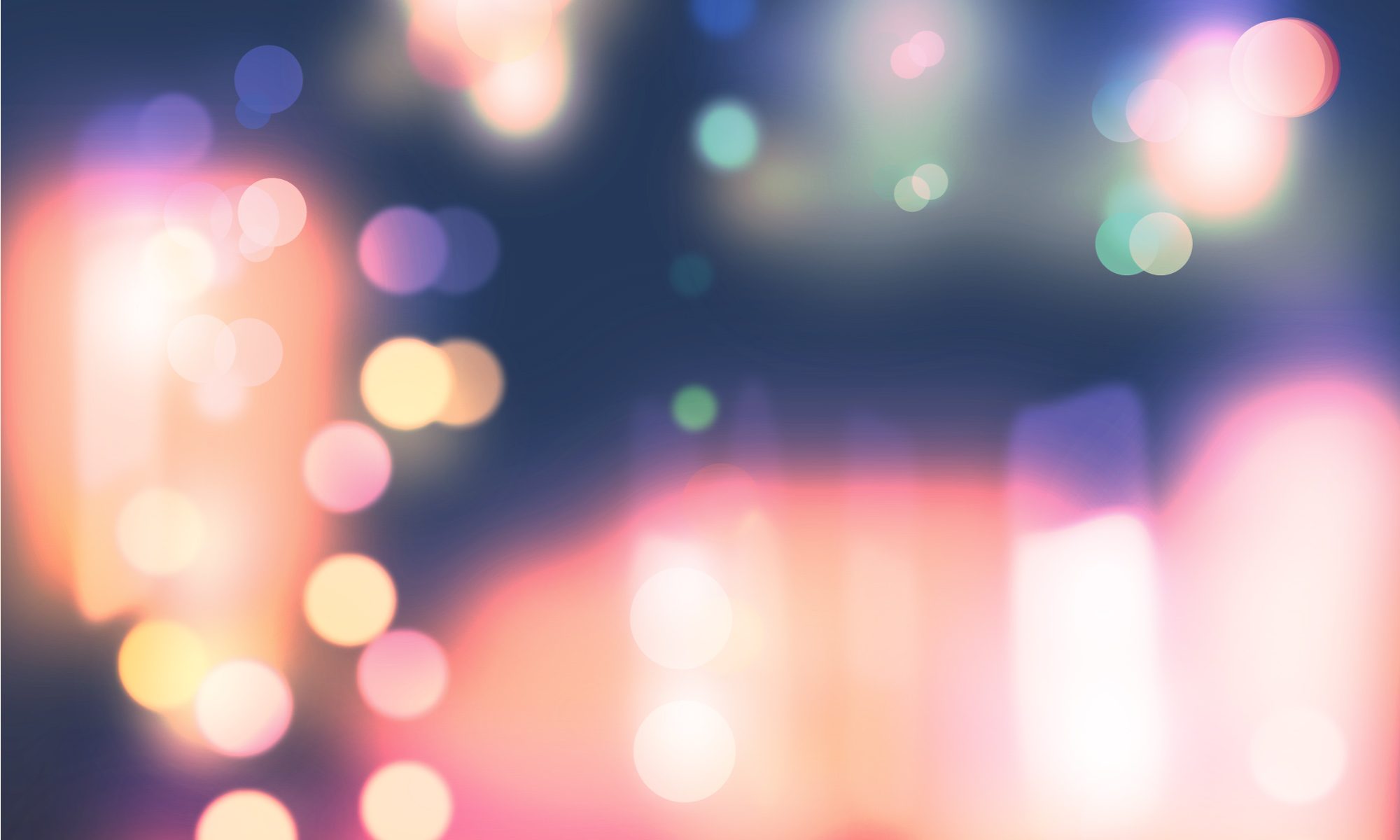
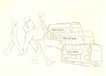
Here I simply used vehicles and perspective to play around with movement, I felt these simple shapes could look great as a print.
In this design I wanted to capture a feel of travel and transportation through Northenden.
I used imagery of people, shops, roads and cars within a symbol of what I think represents community.
Here I was inspired by Maija Louekari work, using repetition to enforce movement, I involved people in motion along with a bus and welcome text to condense core aspects of Northendens dynamic into a design.
I decided to use this design, I used repetition of busses and people along with important in theme text, I feel this piece emodies a clean design along with significant contextual features.
I layered my prints in different colours, two in blue, red and white and another in blue, red and yellow. I am pleased with these outcomes as they play around with times and seasons though always remaining is the hussle and bustle of life day or night.
I used an intaglio process through lino cut carving my outlines into the piece. I had some problems printing the text as the font was very small however next time I would use a larger block or a smaller tool.
I used colours in my prints that could refer to time of day, darks and lights to explore life throughout the seasons.
Textiles
I decided to further my textiles development by combining print and stitch, sewing detail and outlines along the printed design.
I feel the sample is good development, I like the idea of print and stitch though I feel next time I would like to emit emotive colours and artistic sophistication.
I then used a sewing machine to add detail and outlines
I used oil paint to print this piece onto felt, applying a light image of my design
I feel it would be important next time to use artistic values such as contrast and quality fabric and thread.